Challenges
Students vs food waste
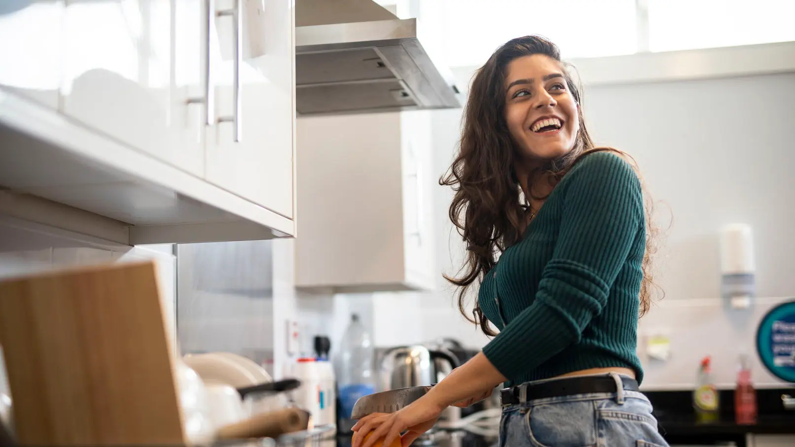
The project emerged from my firsthand experiences of student life, where living alone presents a daily challenge with grocery shopping. Supermarket portions, designed for families or larger households, frequently result in food waste or unnecessary expenditure for individual students. This recurring problem inspired an investigation into how portion sizes affect student food waste, leading to the development of a solution that could help students better manage their grocery purchases and reduce waste.
Project Aims
Identify Problem
To understand and address the portion distortion problem faced by students living alone.
Create Solution
To develop a solution that helps students reduce food waste from oversized grocery packaging.
Process
The project progressed through 5 key phases: starting with research to understand the issues, followed by collaborative ideation to explore potential solutions. Design iteration phase developed both digital and physical prototypes, which were then evaluated through user testing. The process concluded with final designs that integrated user feedback into both digital and physical touchpoints.
research
Tools & Methods
Field Research
Interview
Card Sorting
State-of-the-art revew
Personas
Scenarios
User journey map
Wireframing
Paper Prototype
Usabilty Testing
Heuristic Evaluation
Background Research
Understanding the Problem
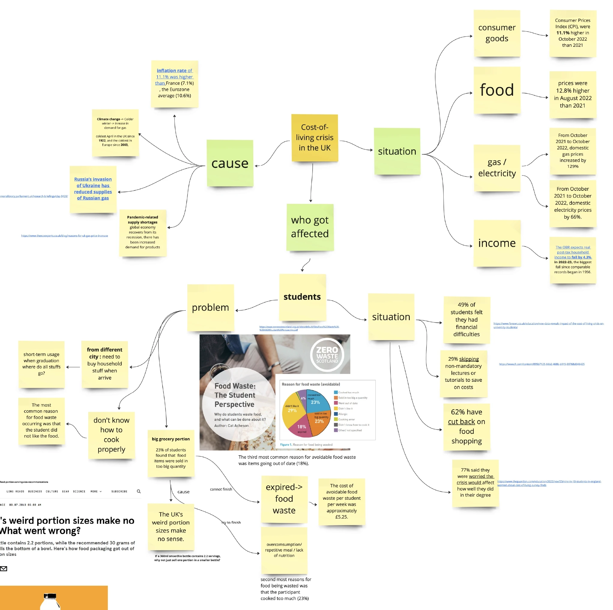
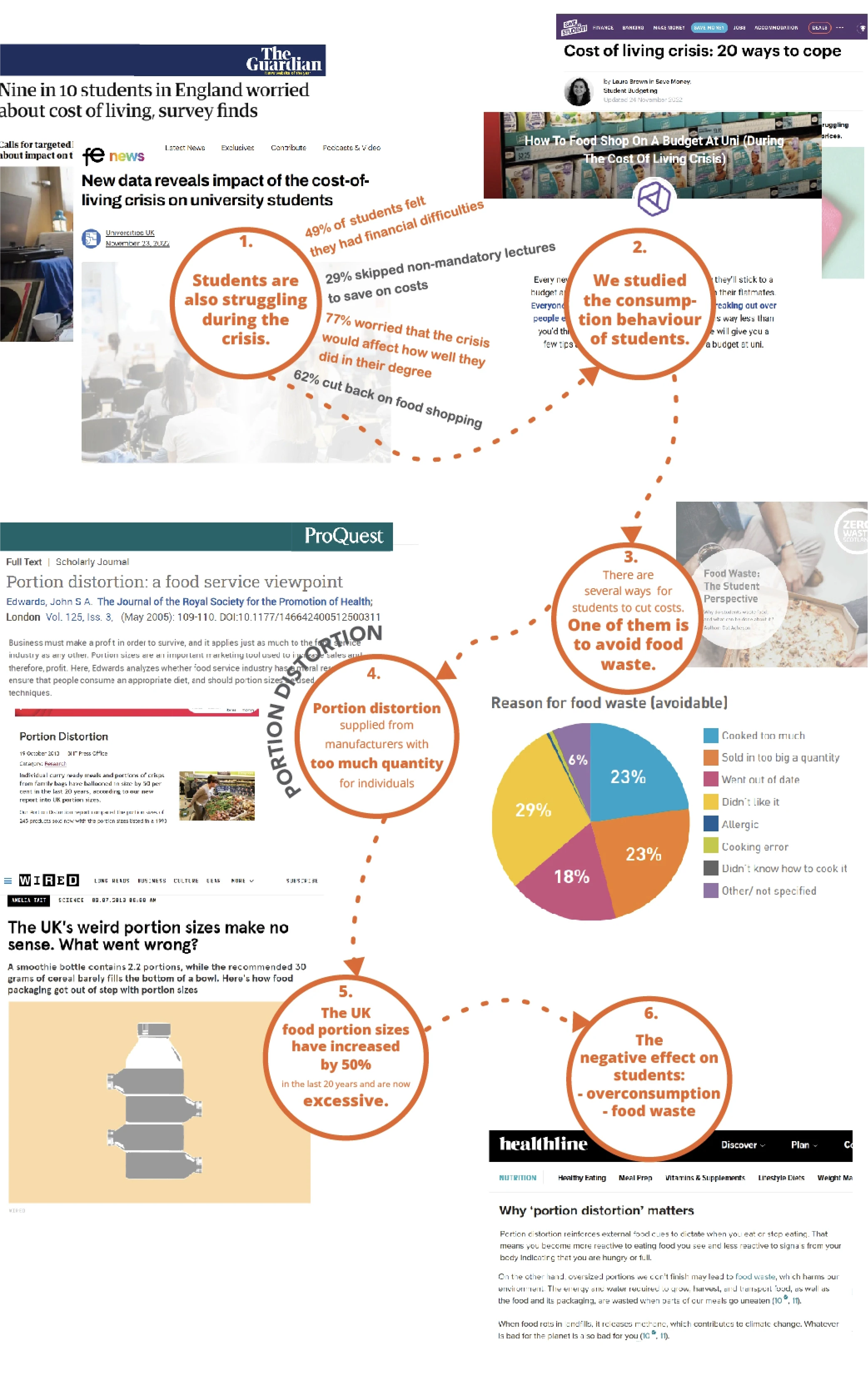
The research process began with investigating student consumption behaviour through secondary research and existing studies. This background research examined literature around portion distortion, student living costs, and food waste patterns in the UK.
Key Background Research Findings:
Root Source
Portion
Distortion
Direct Impact
of food waste among students stems from quantity issues - 23% from cooking too much and another 23% from products being sold in too large quantities
Ultimate Consequences
Food waste
Overconsumption
Throwing away expired food
Eating more than needed
Health implications from larger portions
Unnecessary spending on excess quantities
Field Research
Validating the Reality
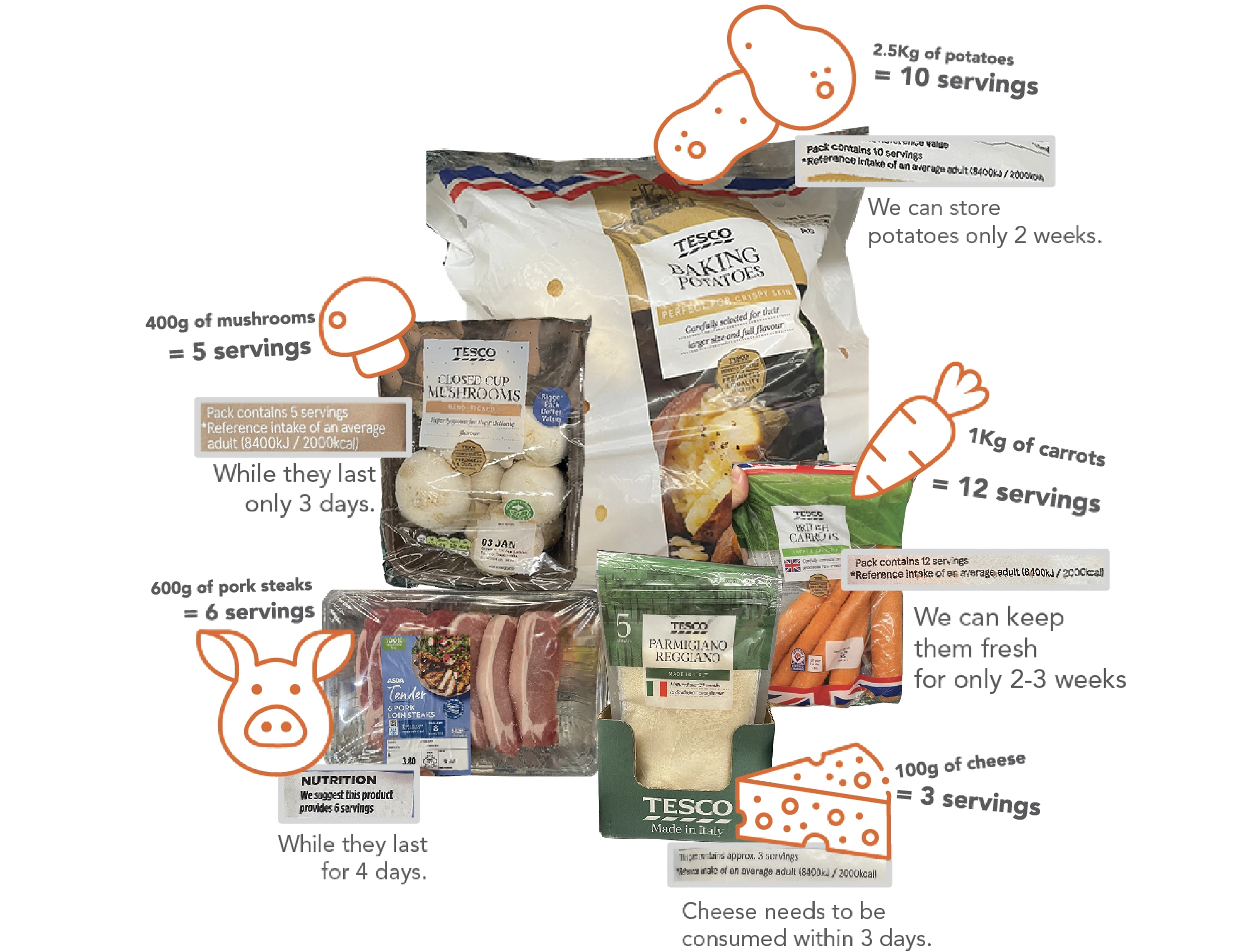
I conducted field research by visiting supermarkets to verify if portion distortion is a real problem. I visited Tesco, Asda and documented common student grocery items, analysing their packaging sizes, serving portions, and shelf life.
This field research confirmed that:
Package sizes are consistently too large for individual consumption
Food shelf life doesn't match the serving quantities
Students living alone face a practical challenge: finish large portions quickly or risk wastees, serving portions, and shelf life.
User Research
Hearing the Stories
In-depth interviews were conducted with 4 students, with each session lasting 12-16 minutes. Participants were recruited through convenience sampling, focusing on students who handle their own grocery shopping. The research aimed to understand their shopping behaviours, challenges with portion sizes, and current solutions they employ to manage food waste.
Key Survey Findings:
Shopping Behaviour
Students shop weekly but struggle to plan portions
Price often forces them to buy larger packages despite knowing they can't finish them
Bulk pricing encourages overbuying
Waste Patterns
Regular food waste due to inability to consume full packages
Feeling of guilt about throwing away food
Financial impact of wasted groceries
Environmental concerns about waste
Coping Strategies
Some share with flatmates when possible
Freezing portions when feasible
Avoiding certain products due to package size
Planning meals in advance to minimise waste
Ideation
Card Sorting Ideation
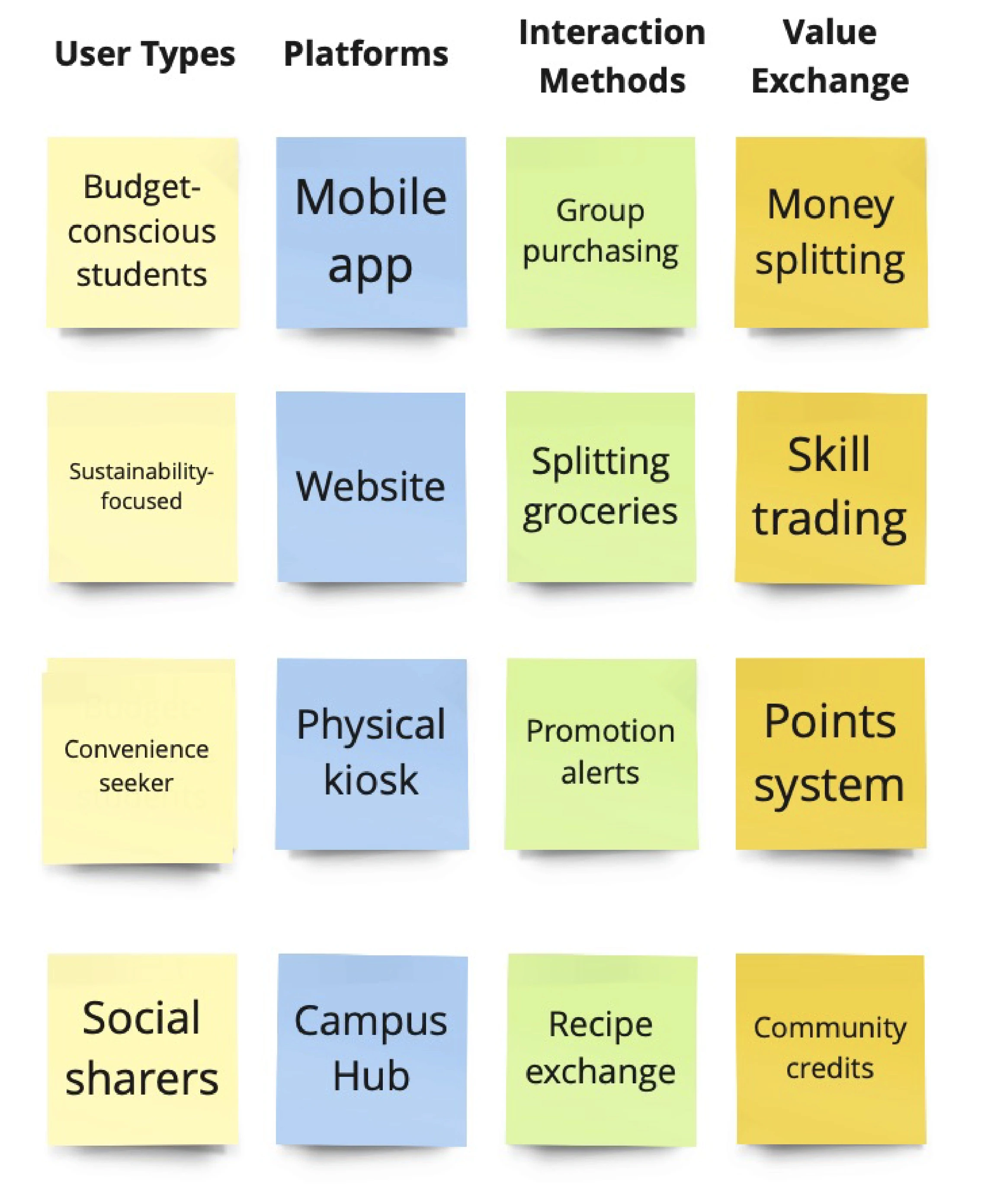
Following comprehensive user, field, and background research, a collaborative card sorting session was conducted using Miro's digital workspace. This online platform enabled digital collaboration and this method help exploring of potential solutions.
The card sorting process categorised ideas into 4 key dimensions:
User Types (considering different student behaviours and needs)
Platforms (various digital and physical touchpoints)
Interaction Methods (different ways users could engage)
Value Exchange (systems for trading and sharing)
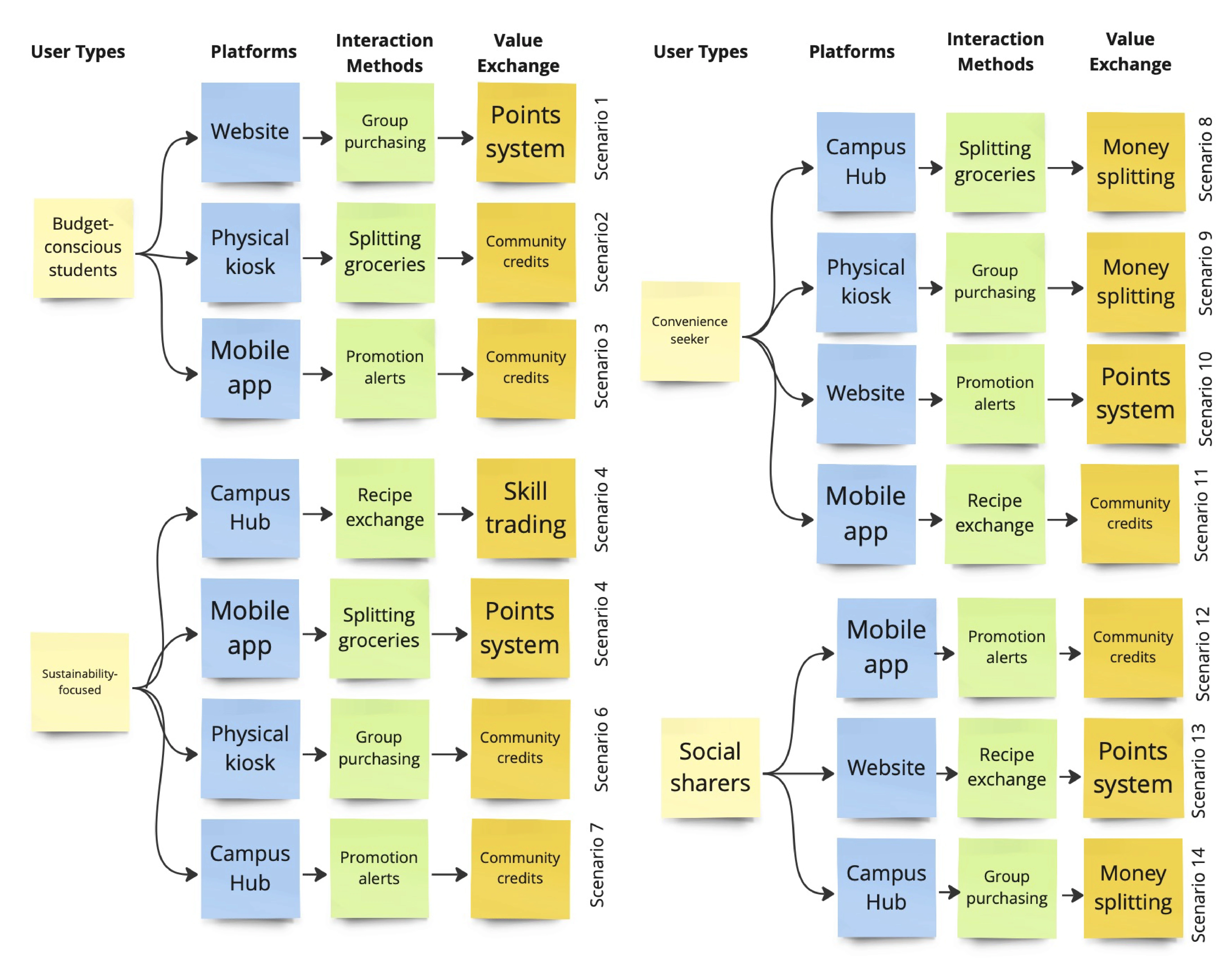
Through this structured ideation process, multiple scenarios emerged by connecting those dimensions. This systematic exploration of scenarios helped identify the most promising solution:
A platform connecting users to share groceries.
This concept emerged as the optimal way to address the portion distortion problem while accommodating various user needs and behaviours.
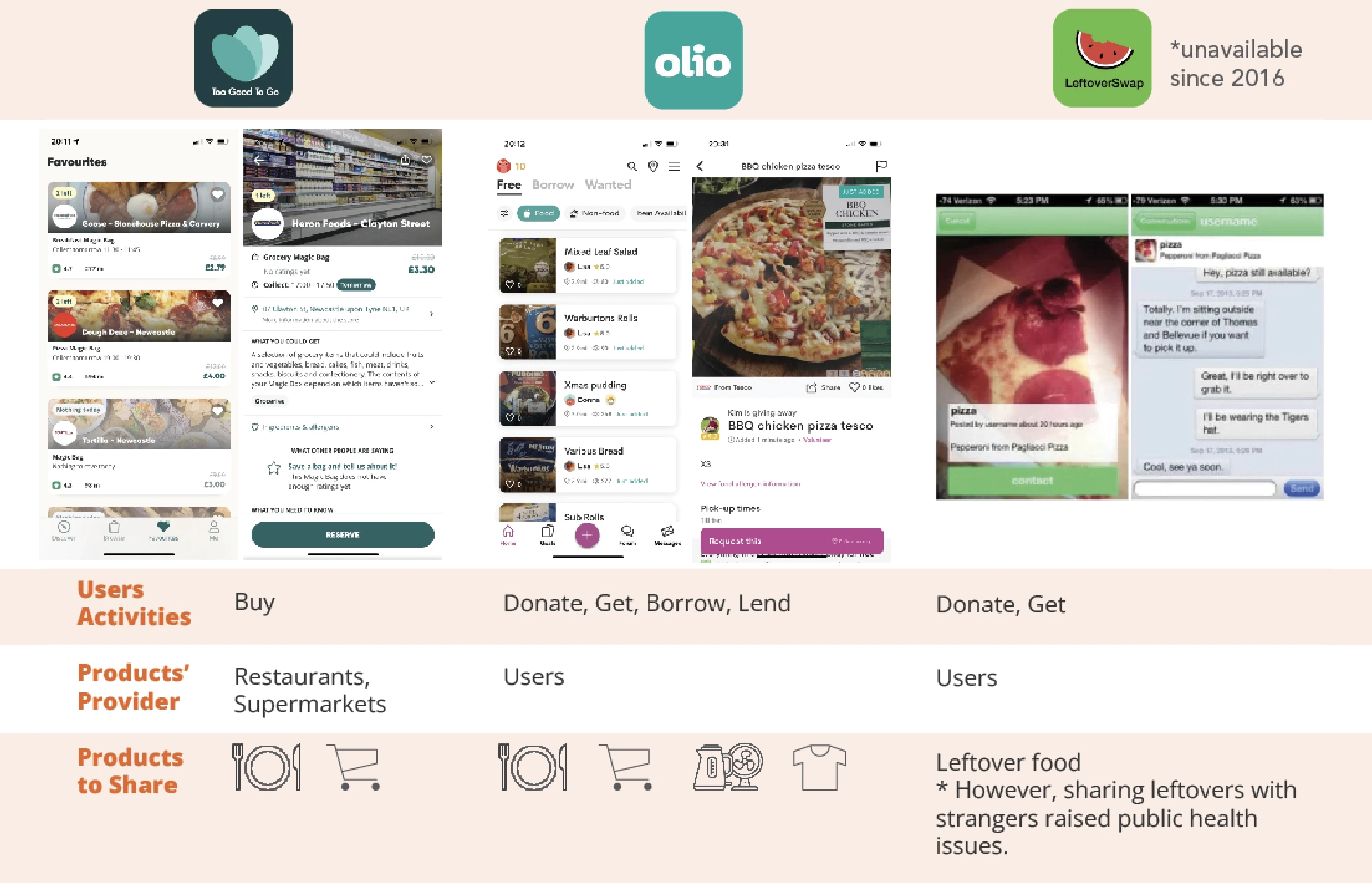
State of the Art Review
Exploring Existing Solution
Key Takeaways:
Health and hygiene considerations are more prevalent in sharing food.
The common platforms for food sharing are getting food from restaurants and supermarkets.
The food sharing amongst users is typically a donation.
There is no application for peer-to-peer sharing of groceries.
People are more cost-conscious when they have to pay
Design Concept
A Grocery Platform
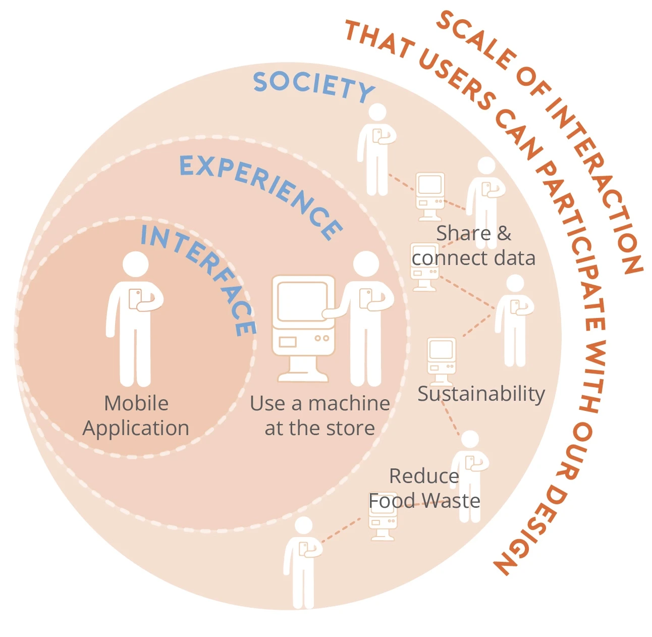
The concept began with a simple yet powerful idea: connecting students digitally to share their grocery purchases. As the solution evolved, it became clear that while digital connections were essential, students needed a practical way to exchange groceries during their shopping journey as seen in the scale of interaction diagram
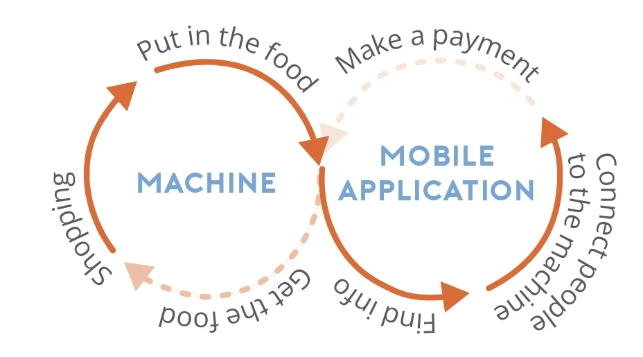
Both digital and physical platforms will support users seamlessly, creating an integrated ecosystem where students can choose their preferred way to participate in grocery sharing. The mobile application serves as the primary platform for connecting and coordinating with other students, while the physical machines act as convenient touchpoints for immediate sharing opportunities during shopping.
Personas
To better guide the design and enable everyone on the team to empathise with our users, I further synthesised the interview results and came up with the following personas:
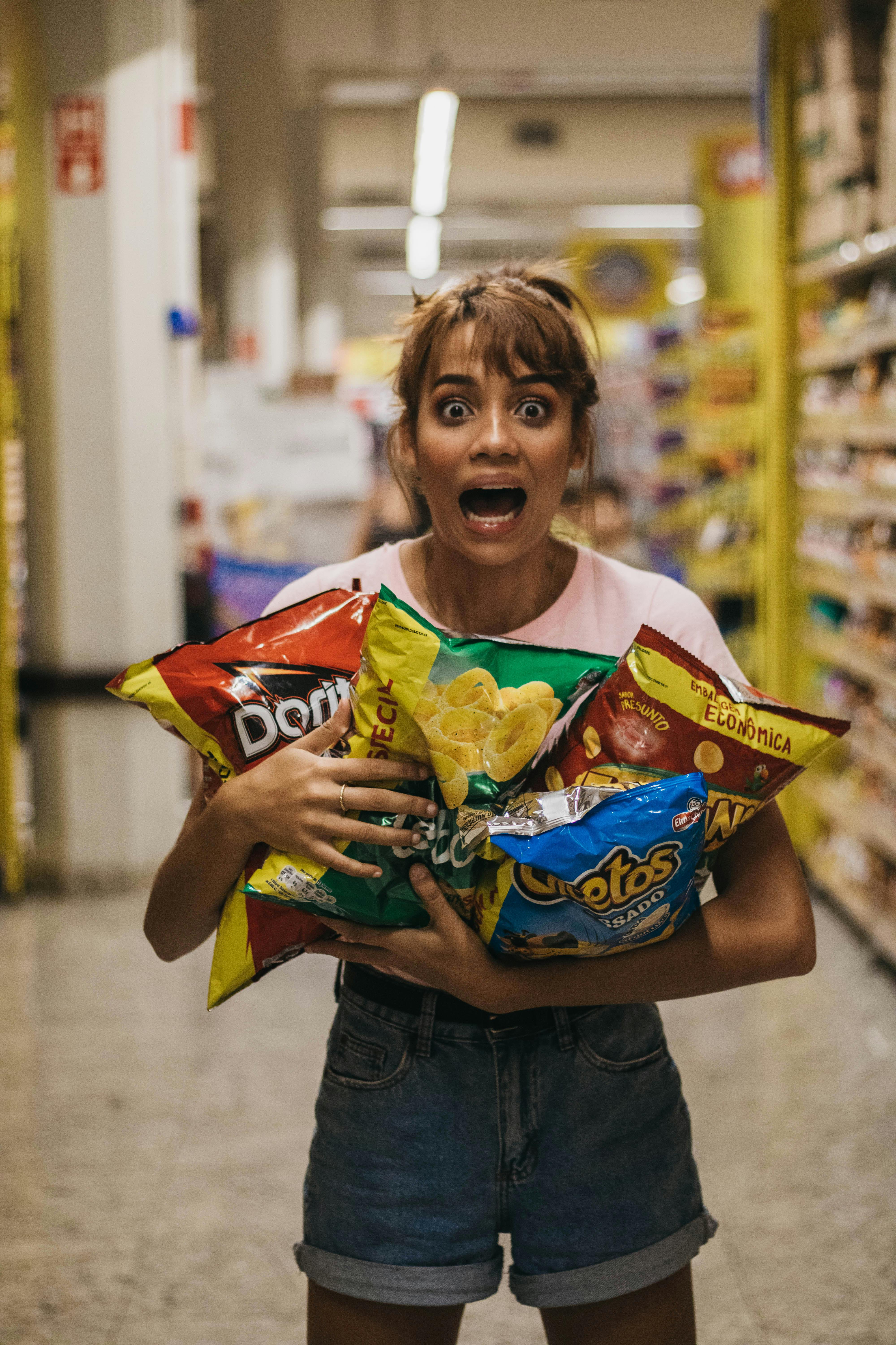
Alice the Shopper
Scenario:
Already at the supermarket doing regular shopping
Finds portions too large for individual consumption
Wants to purchase but only needs half the quantity
Needs:
Immediate solution while shopping
Simple way to find share partners
Secure payment splitting
Frustrations:
Buying full portions leads to waste
Limited storage space
Spending more than necessary
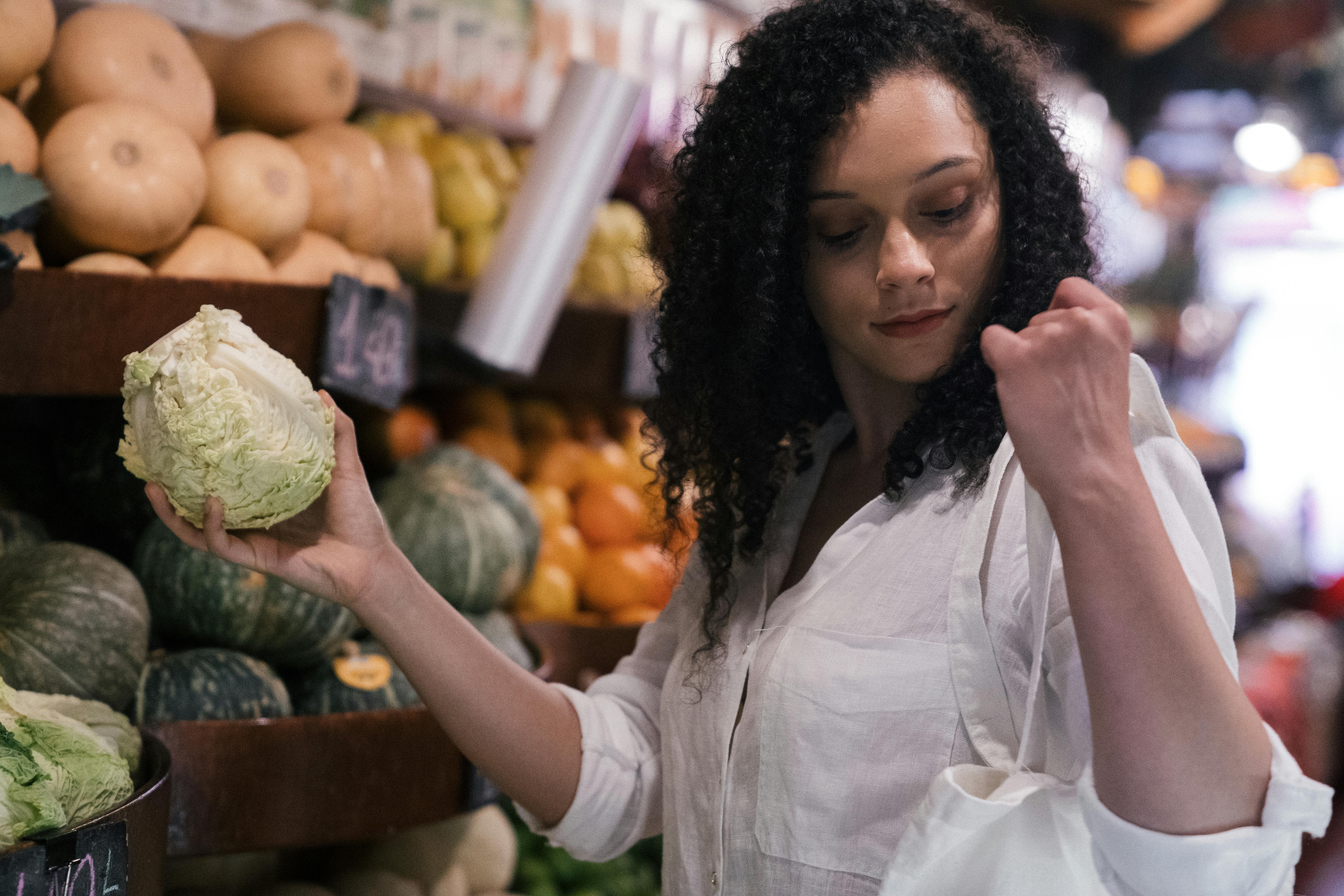
Jane the Browser
Scenario:
Needs specific ingredients for cooking
Avoids buying due to large package sizes
Needs:
Connect with reliable sharing partners
Browse available sharing opportunities
Frustrations:
Limited budget for full packages
Waste from previous experiences
Difficulty finding others who want to share
Scenarios
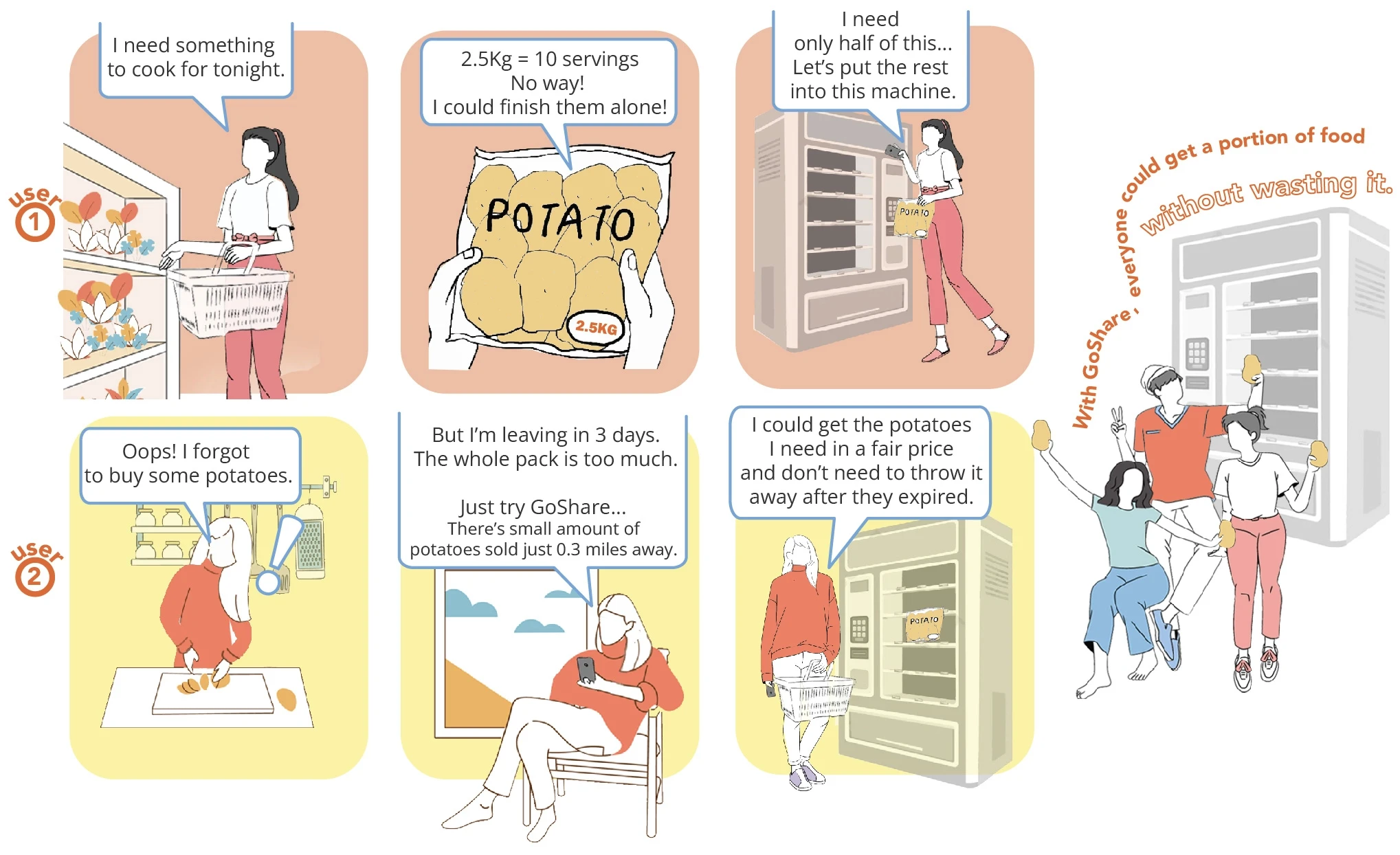
Following persona development, key scenarios were visualised to demonstrate how different users interact with the grocery sharing solution. Two main user journeys emerged: the shopper who discovers they need to share while at the supermarket, and the browser who plans ahead to purchase shared portions.
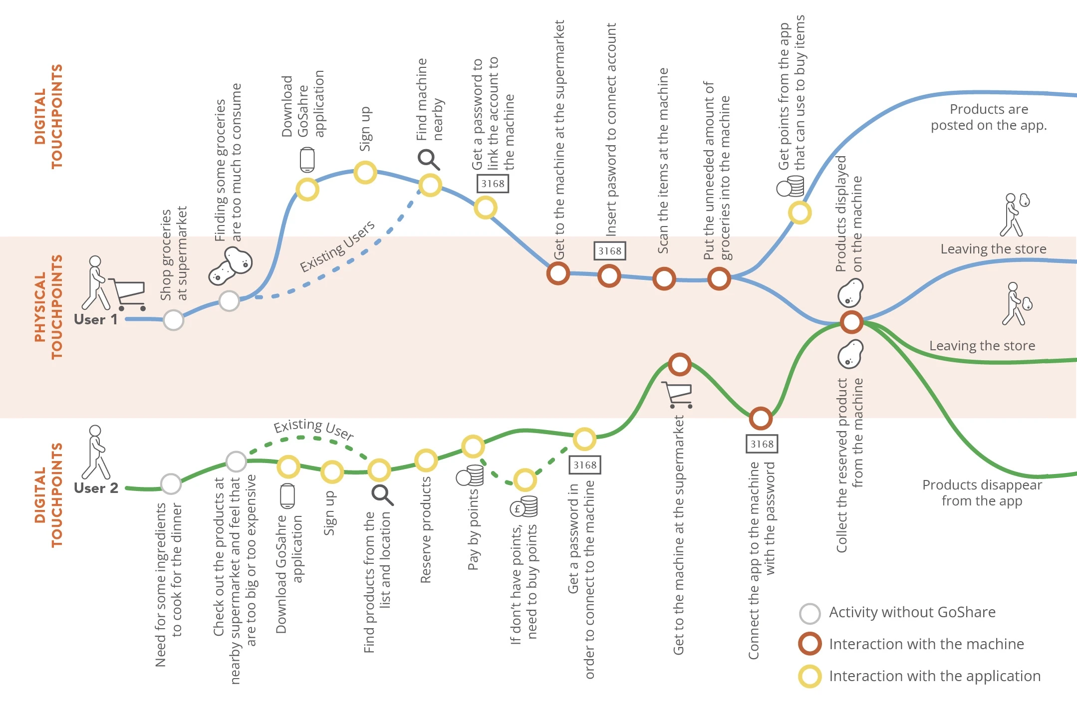
User Journey Map
The user journey map illustrates how the grocery sharing solution connects individuals through both digital and physical touchpoints. The map traces 2 distinct paths, showcasing how users can initiate their sharing journey either from the supermarket or through the mobile application. These interconnected touchpoints demonstrate how the platform seamlessly bridges physical and digital interactions, ensuring users can engage with the system in ways that best match their shopping context and preferences.
Design Iteration
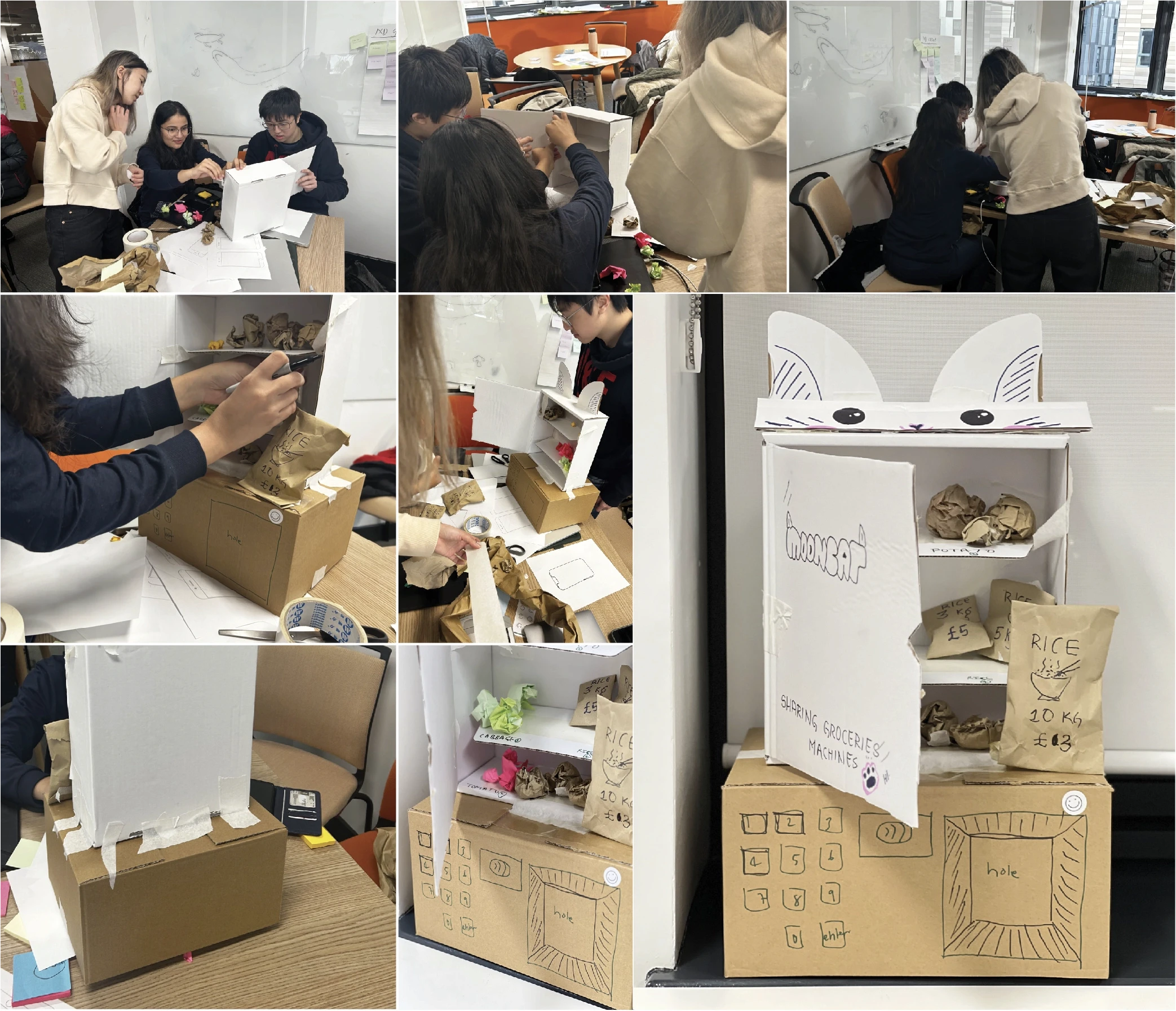
Paper Prototyping
To explore how the physical sharing kiosk would work in practice, a quick paper prototyping session was conducted. This hands-on approach offered a fun and collaborative way to generate ideas and test basic interactions. The team crafted a cabinet-style prototype with multiple compartments, allowing everyone to physically interact with the concept and understand how users might engage with the actual machine.
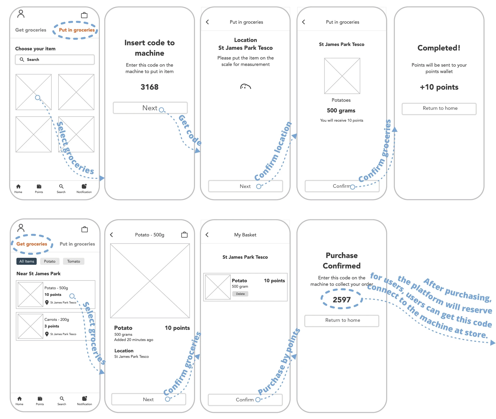
Low-Fidelity Wireframes
Following the physical prototype, low-fidelity wireframes were created in Figma to visualise the mobile application interface. The wireframes focused on two essential functions that connect users:
'Get Groceries' for those looking to purchase shared items
'Put in Groceries' for those wanting to share their excess portions.
This dual functionality ensures seamless interaction between sharing and receiving users through the platform.
Usability Testing
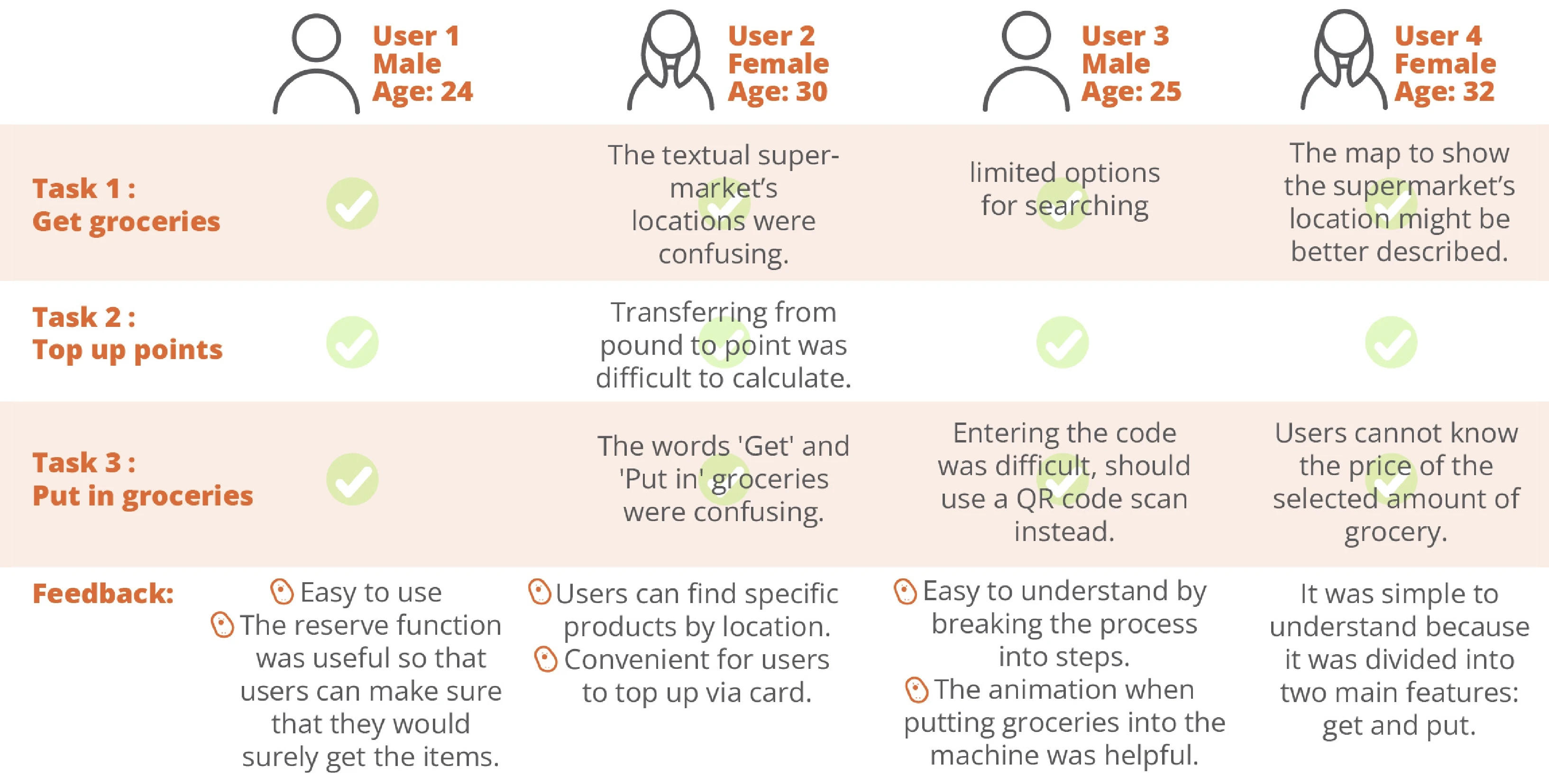
User testing was conducted to evaluate the application's interface and interaction design. The testing focused on three main tasks: getting groceries, managing points, and putting in groceries. Four students who live alone and experience portion distortion problems participated in 15-20 minute cooperative evaluation sessions, using think-aloud techniques to share their thoughts while navigating the interface.
The sessions revealed both strengths and areas for improvement:
Navigation clarity needed enhancement
Point system required simplification
Location features needed better visualisation
QR code scanning suggested as an alternative to manual code entry
This feedback provided valuable insights for refining the interface design and improving user experience.
Heuristic Evaluation
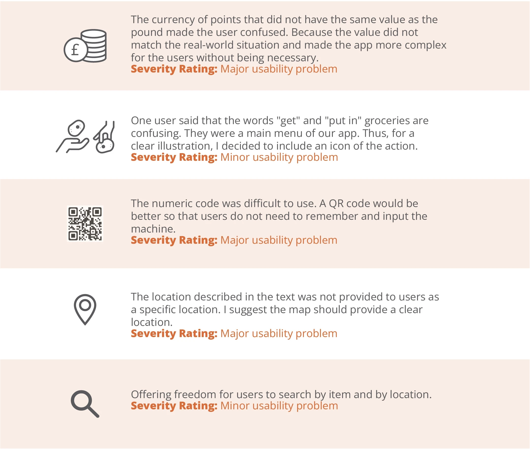
Following user testing, a heuristic evaluation was conducted using Nielsen's criteria to analyse usability issues. Each problem was assessed and assigned a severity rating based on its impact on user experience:
Major Usability Problems:
Points currency system created confusion due to value mismatch with real money
Numeric code entry was cumbersome compared to QR code alternative
Location information lacked specificity and clear visual representation
Minor Usability Problems:
Menu terminology ('get' and 'put in') needed clearer illustrations
Search functionality required refinement for better flexibility
The severity ratings helped prioritise which issues needed immediate attention in the next iteration of the design.
The sessions revealed both strengths and areas for improvement:
Navigation clarity needed enhancement
Point system required simplification
Location features needed better visualisation
QR code scanning suggested as an alternative to manual code entry
This feedback provided valuable insights for refining the interface design and improving user experience.
Final Design
Kiosk Visualisation
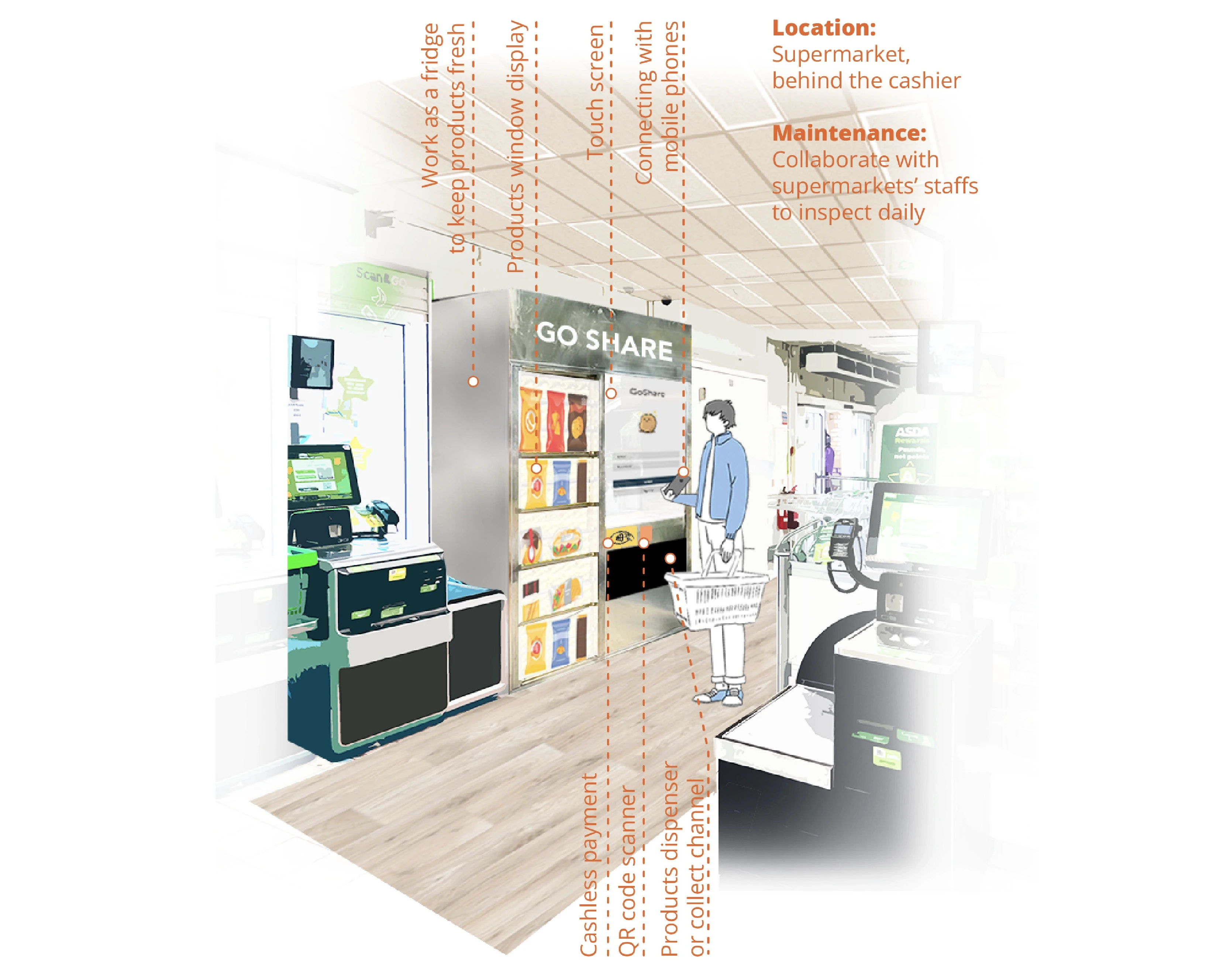
Based on insights from the paper prototype and team discussions, the physical sharing kiosk concept was visualised using image collage techniques. This method helped illustrate how the machine would integrate into a real supermarket environment, showing key features and user interaction points while maintaining product freshness and accessibility.
High-FIdelity Prototype
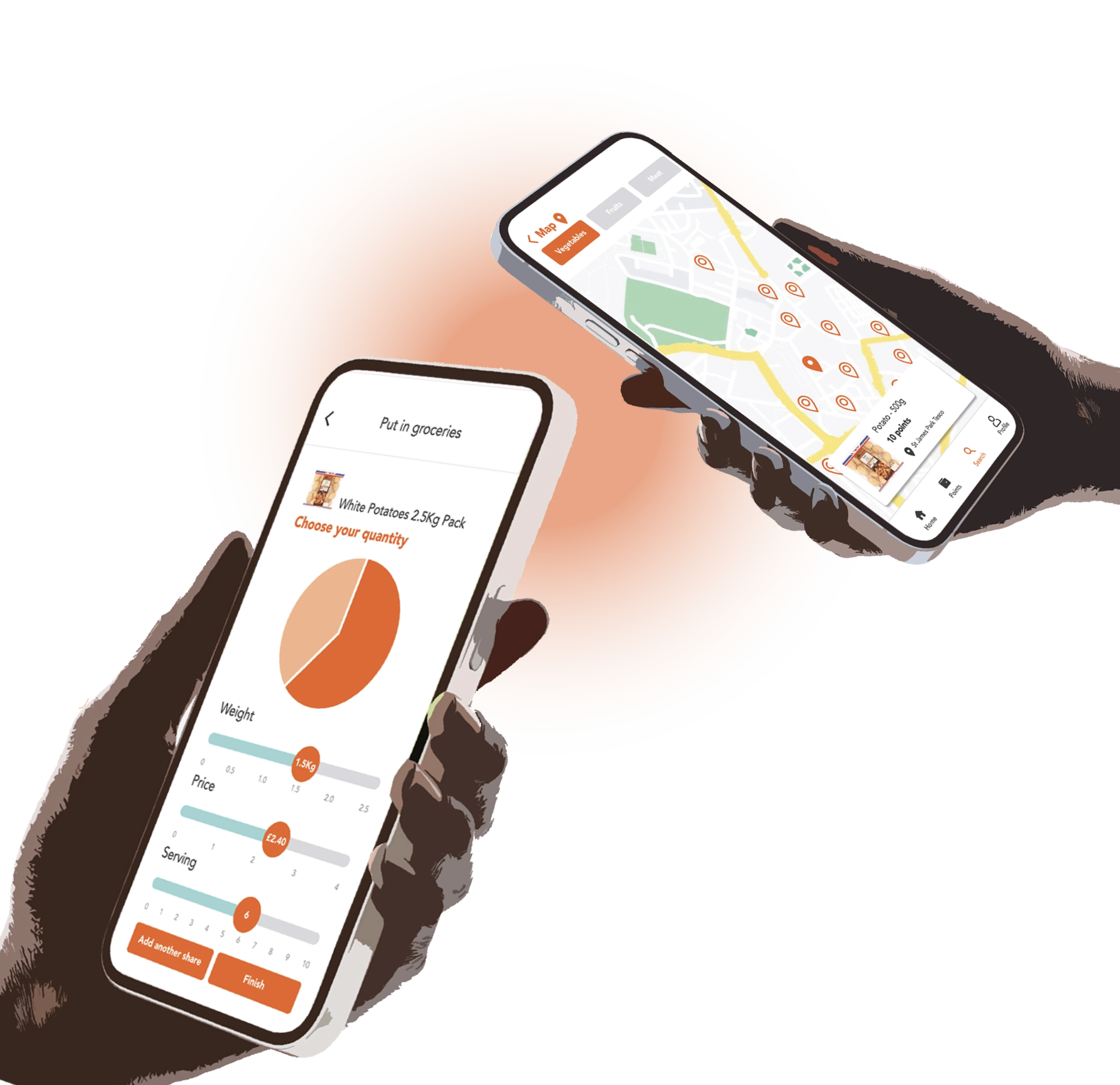
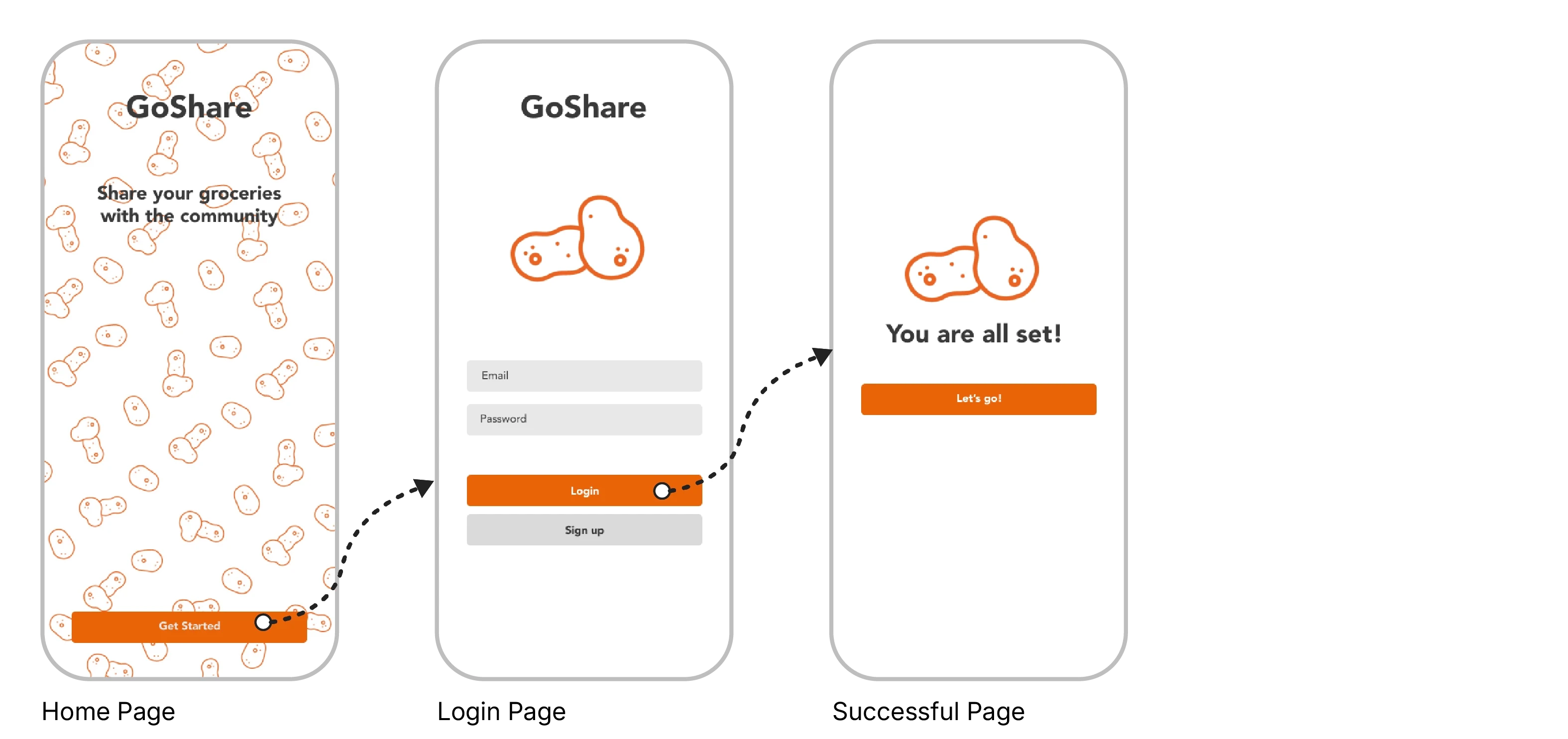
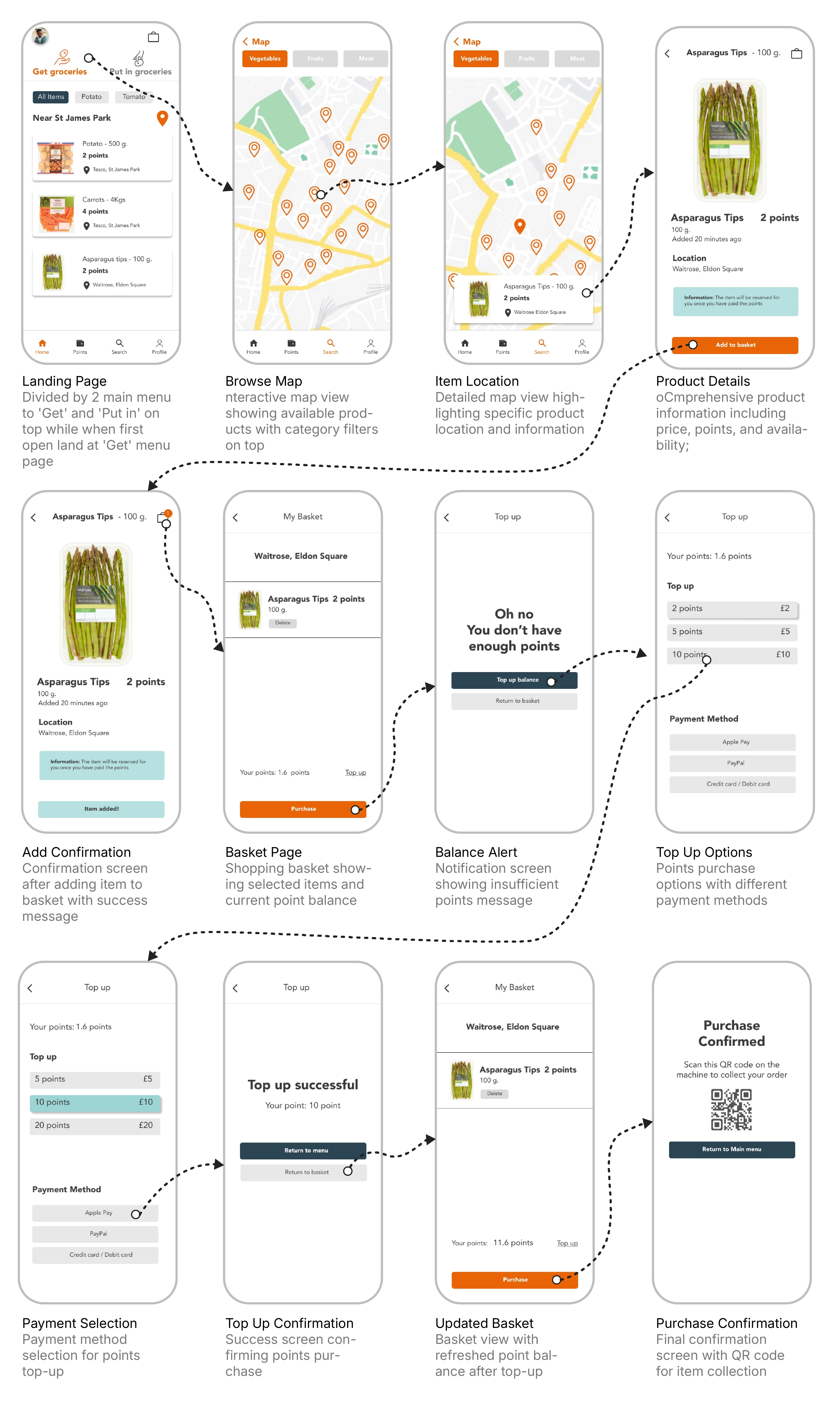
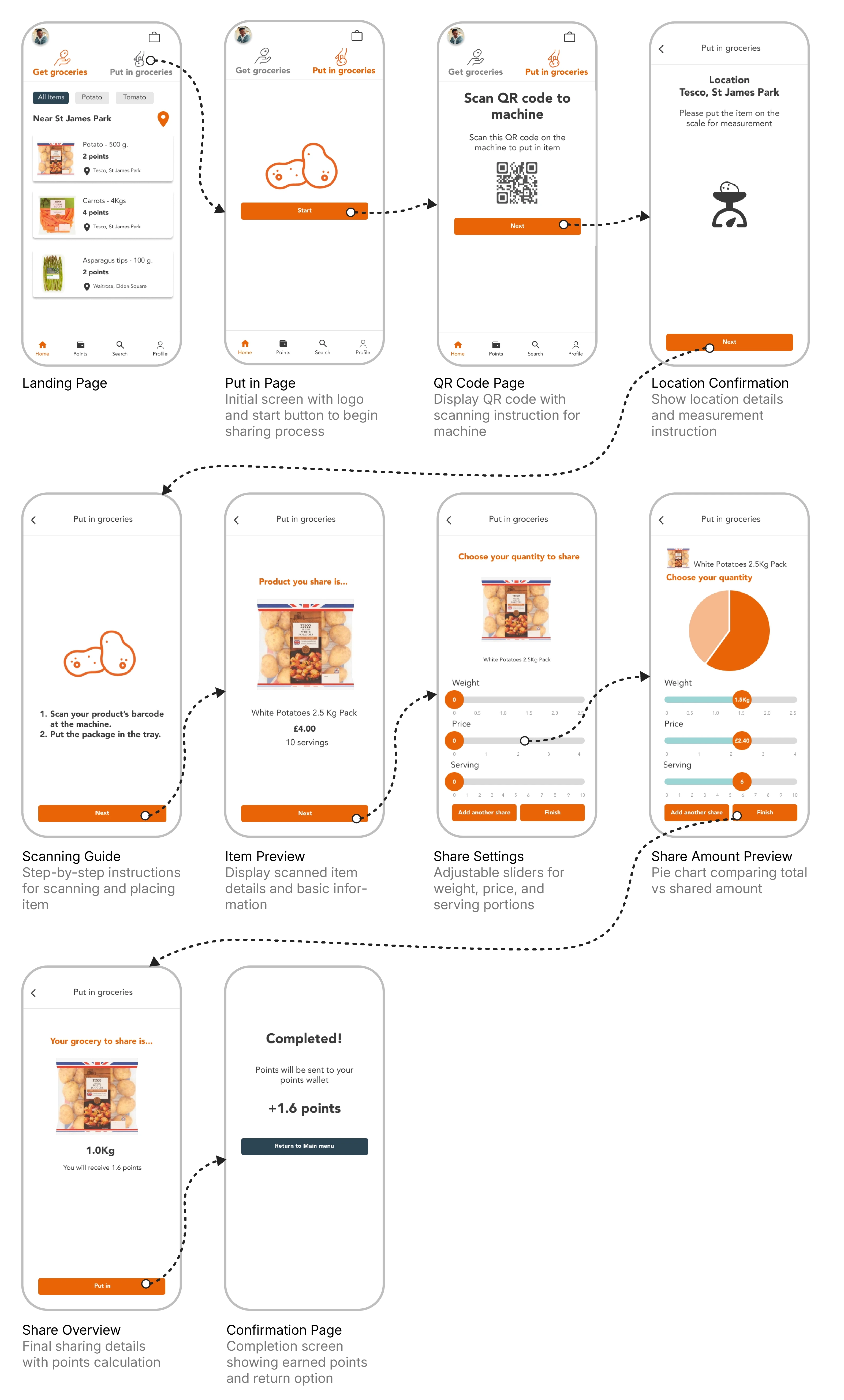
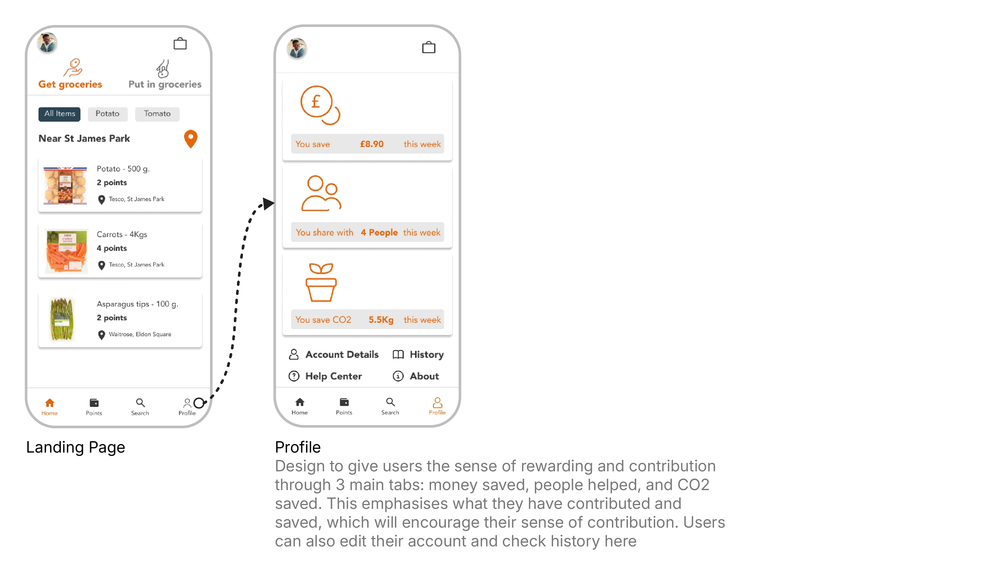
Based on user testing insights and heuristic evaluation, the interface design was refined in Figma. Key improvements focused on resolving usability issues: simplifying the points system, implementing QR code scanning, enhancing location visualization, and clarifying navigation labels with supporting icons. The final design creates a more intuitive user experience that seamlessly connects digital interaction with physical sharing.
Start Menu
Get Menu
Put In Menu
Profile
Key Takeaways
Starting from a personal student challenge with portion sizes, the project evolved into a broader solution for food waste. Through collaborative ideation and systematic design processes, the concept developed into a comprehensive platform that could benefit diverse user groups. Working in a multidisciplinary team brought varied perspectives, enriching the solution's scope and effectiveness.
Next Steps
The next phase focuses on validating the design through high-fidelity prototype testing and detailed exploration of the physical machine mechanics. The solution shows potential for expansion beyond the student community, aiming to include local residents and users without mobile devices. Establishing partnerships with local supermarkets and communities will be crucial for piloting the system in real-world settings, allowing for practical testing and refinement of the sharing concept.
