Challenges
The Overlooked Kiosks
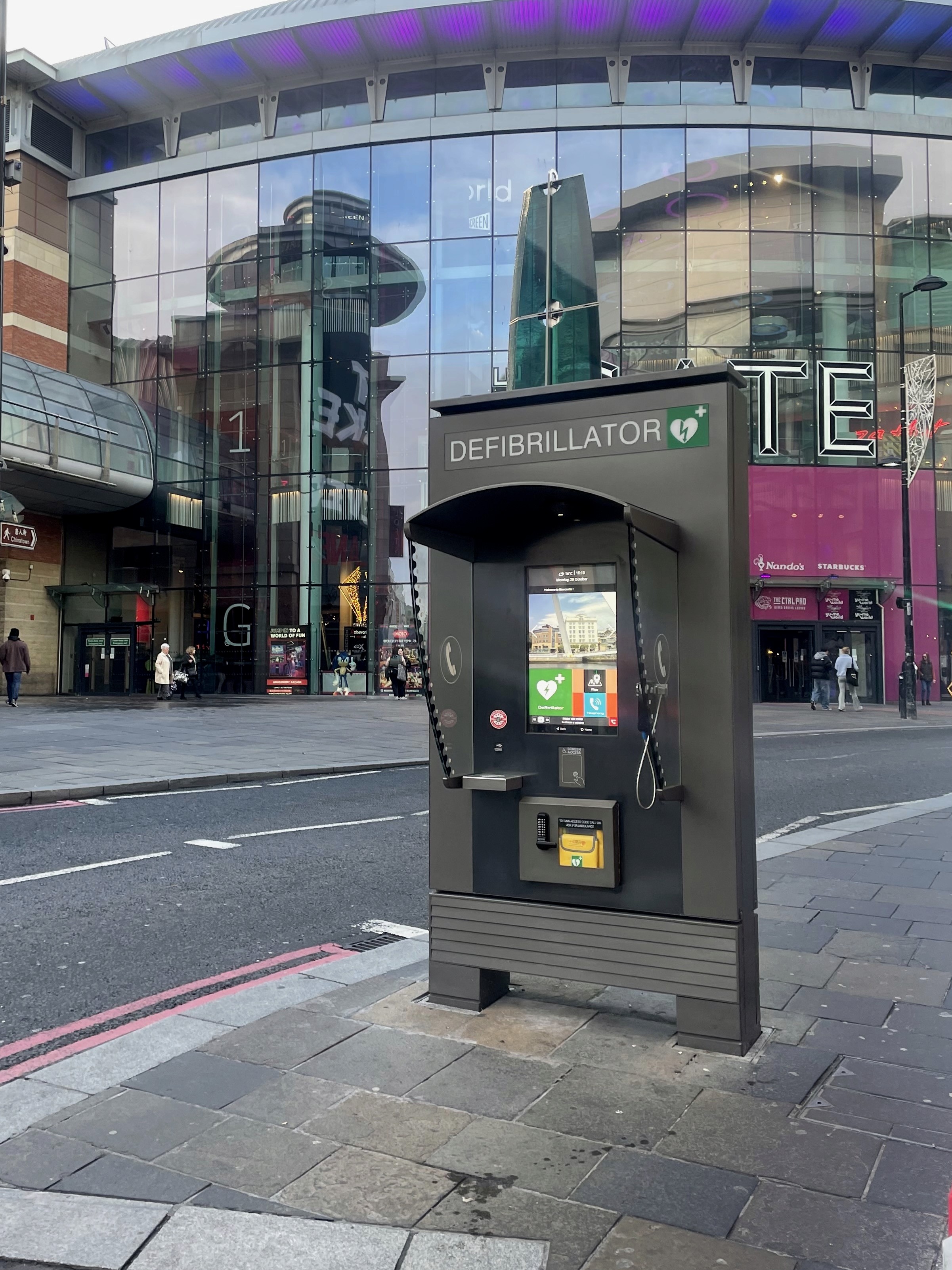
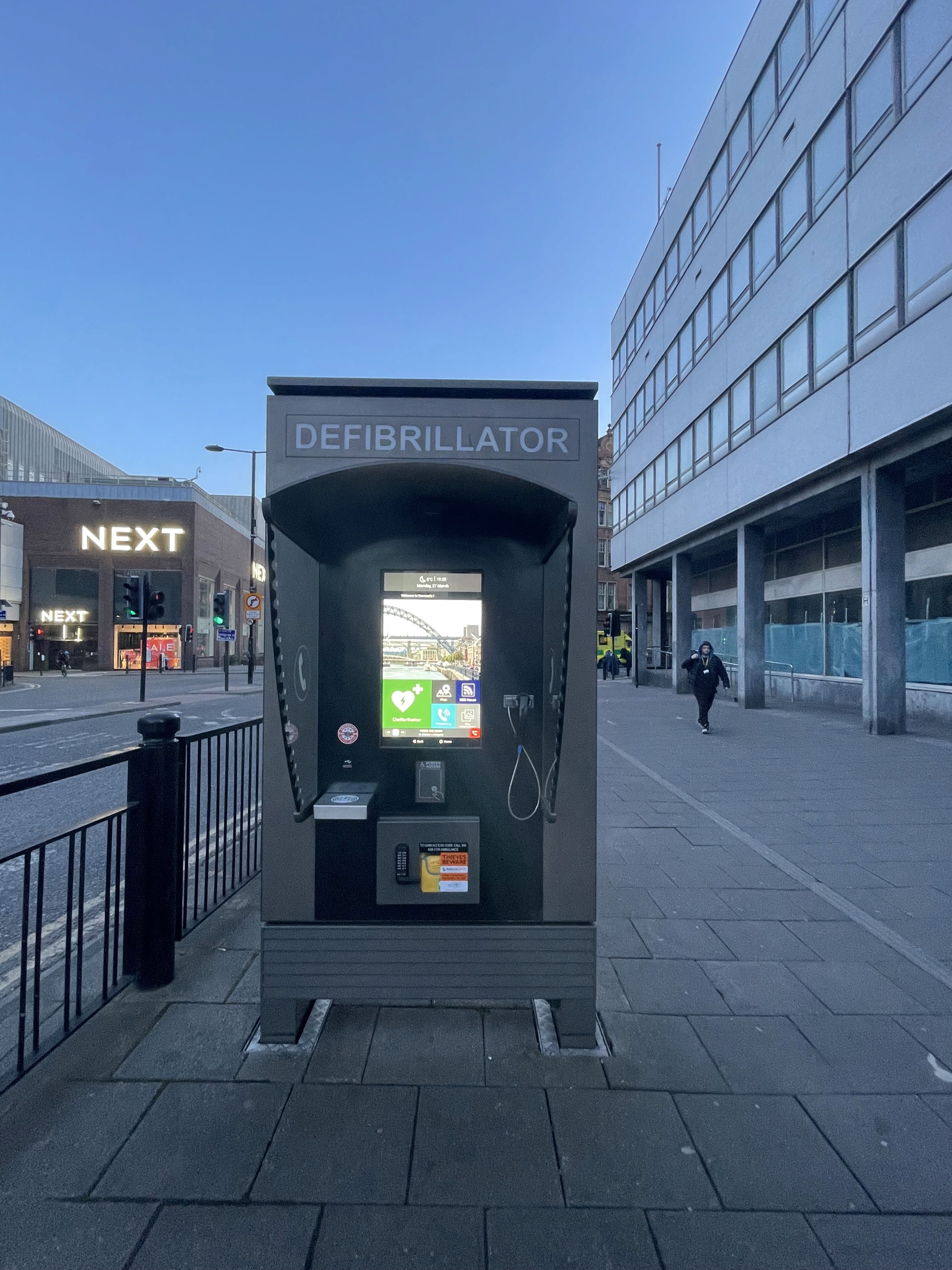
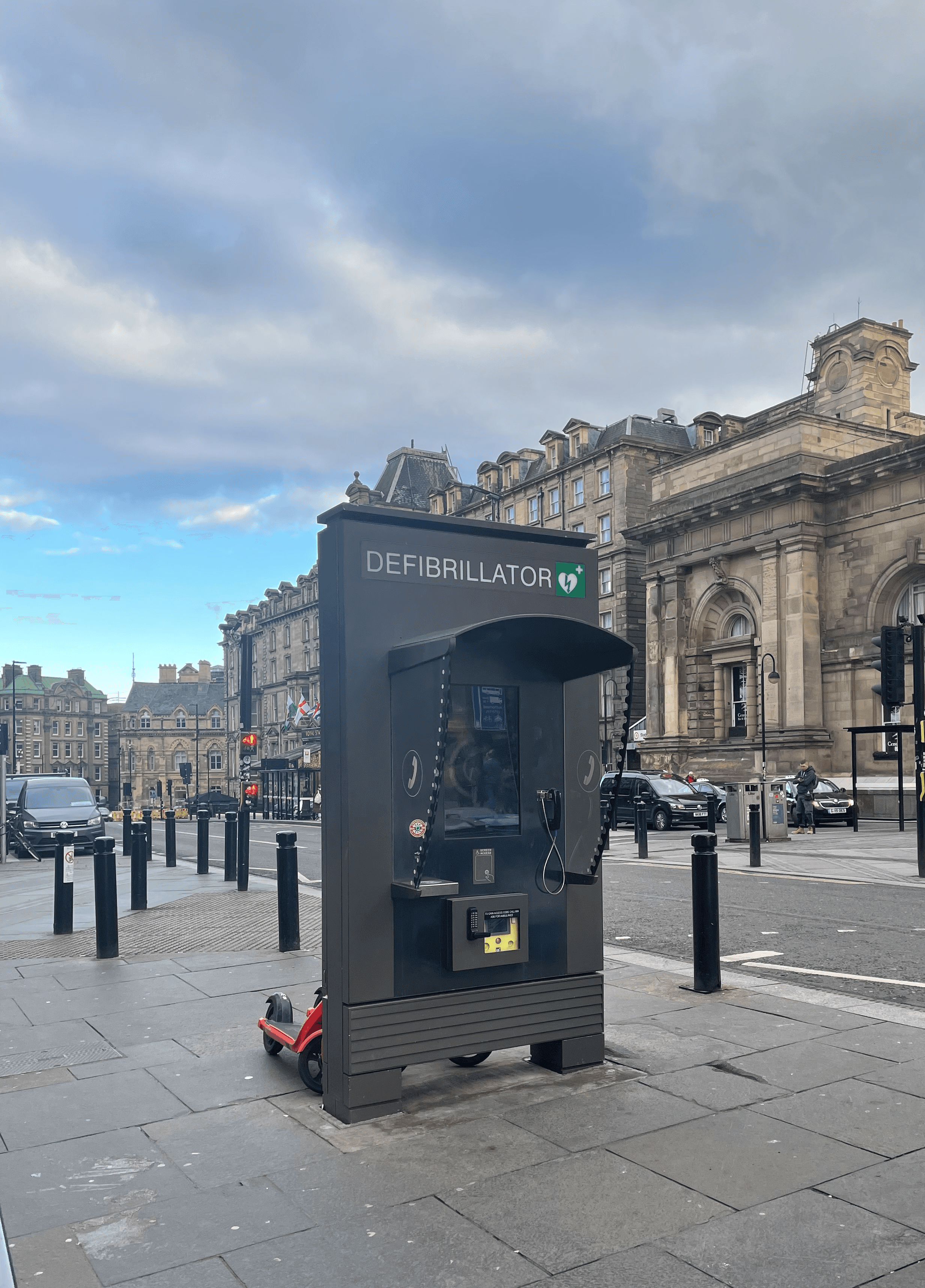
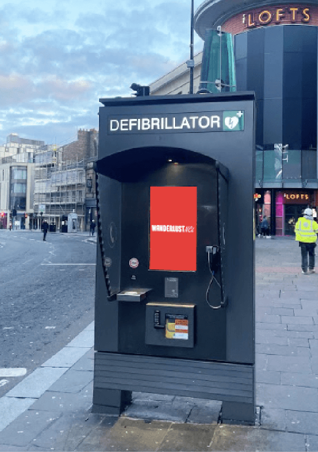
Every day in Newcastle's city centre, interactive kiosks stand quietly among the bustling crowds, largely unnoticed by passing visitors. Our project began when our team's curiosity led us to investigate these overlooked installations. What we discovered was intriguing: these kiosks were equipped with potentially valuable features - interactive maps, city information, and even emergency defibrillators.
Upon closer examination, we found that despite their promising capabilities for guiding tourists through Newcastle, significant usability issues were keeping them from reaching their full potential. The map feature particularly caught our attention - beneath its current limitations lay the foundation for something transformative.
This discovery sparked our mission: to reimagine these underutilised resources into engaging tools that could genuinely enhance how visitors explore Newcastle. More than just a technical upgrade, we envisioned a system that could transform the way people experience our city.
Key Project Objectives
Maximising Existing Resources
Breathe new life into Newcastle's established kiosk network by implementing an intuitive navigation system that builds upon existing city infrastructure.
Empowering City Exploration
Guide visitors to discover Newcastle confidently and immersively, whether they're in the city for a football match or a longer stay.
Process
The process of WanderlustNCL followed a 5-stage journey focused on creating a functional demonstration prototype. Beginning with comprehensive field and user research, the process established a solid understanding of existing infrastructure and tourist needs in Newcastle. These insights guided the ideation phase, where potential solutions were explored and refined through collaborative evaluation. The process then moved into interface design, translating concepts into user-friendly digital interactions for both kiosk and WanderBox systems. Physical prototyping followed, bringing the WanderBox hardware and WanderCard designs to life through iterative development. Finally, all components were integrated into a working demonstration that showcased the complete tourist journey experience.
research
Tools & Methods

Field Research
Interview
Personas
User journey map
Wireframing
HTML
Microbit
Field Research
Investigating Existing Kiosks
The field research focused on understanding the current kiosk ecosystem in Newcastle's city centre through systematic observation and interaction testing.
Infrastructure Distribution
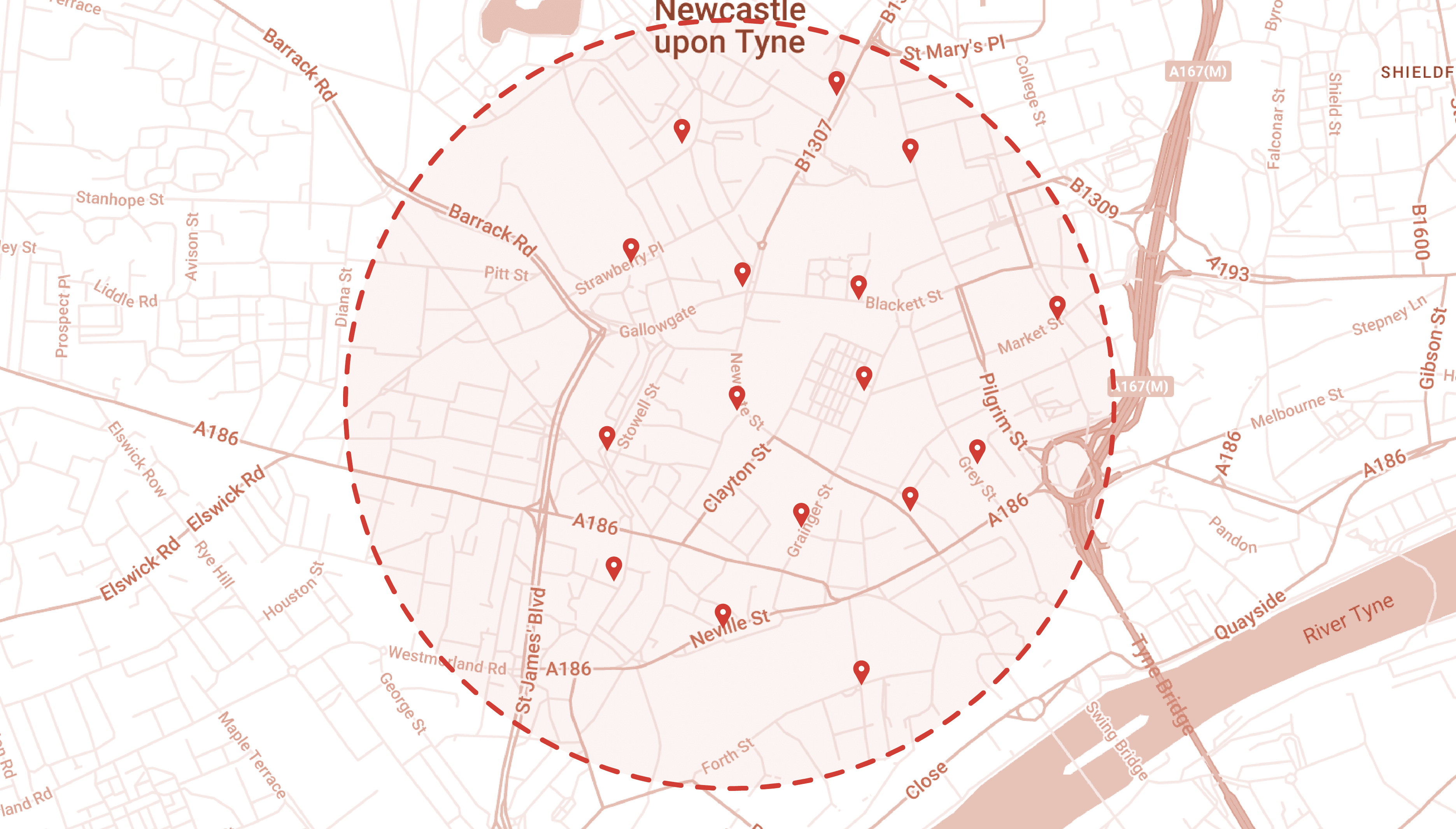
Located throughout Newcastle's busy city centre
Approximately 16 kiosks identified
Strategic placement every 200-500 meters
Consistent interface and functionality across all units
Identified Issues:
High-visibility locations yielding low engagement
Valuable city-centre space occupied by underutilised infrastructure
Investment in technology without meaningful public benefit
Feature Analysis
While the kiosks offer multiple features, our analysis concentrated on 2 key features relevant to tourist navigation:
City Information Feature
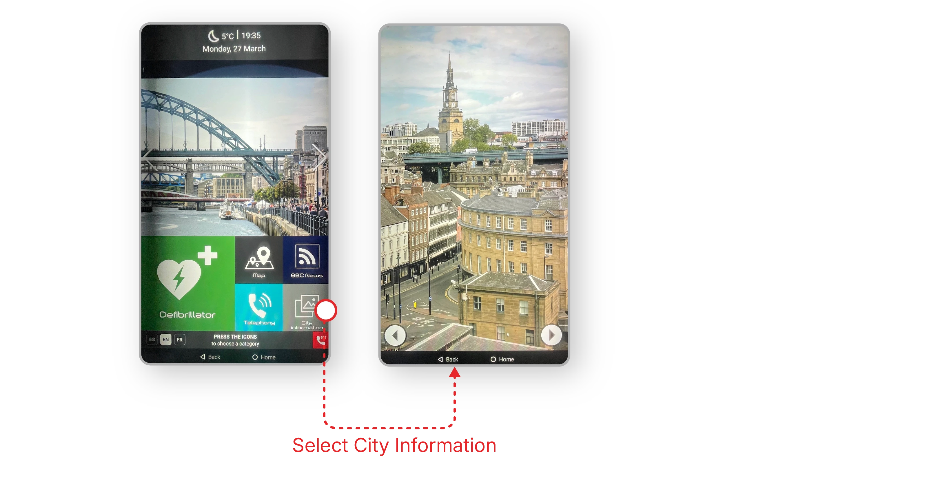
Limited to displaying high-quality photographs of Newcastle attractions
Lacks contextual information or practical details
No interactive or informative content beyond visual elements
Identified Issues:
Aesthetic-heavy but information-light approach
Missing crucial visitor information (opening hours, descriptions, prices)
No real-time updates or seasonal content
Failure to showcase local culture and stories
Map Feature
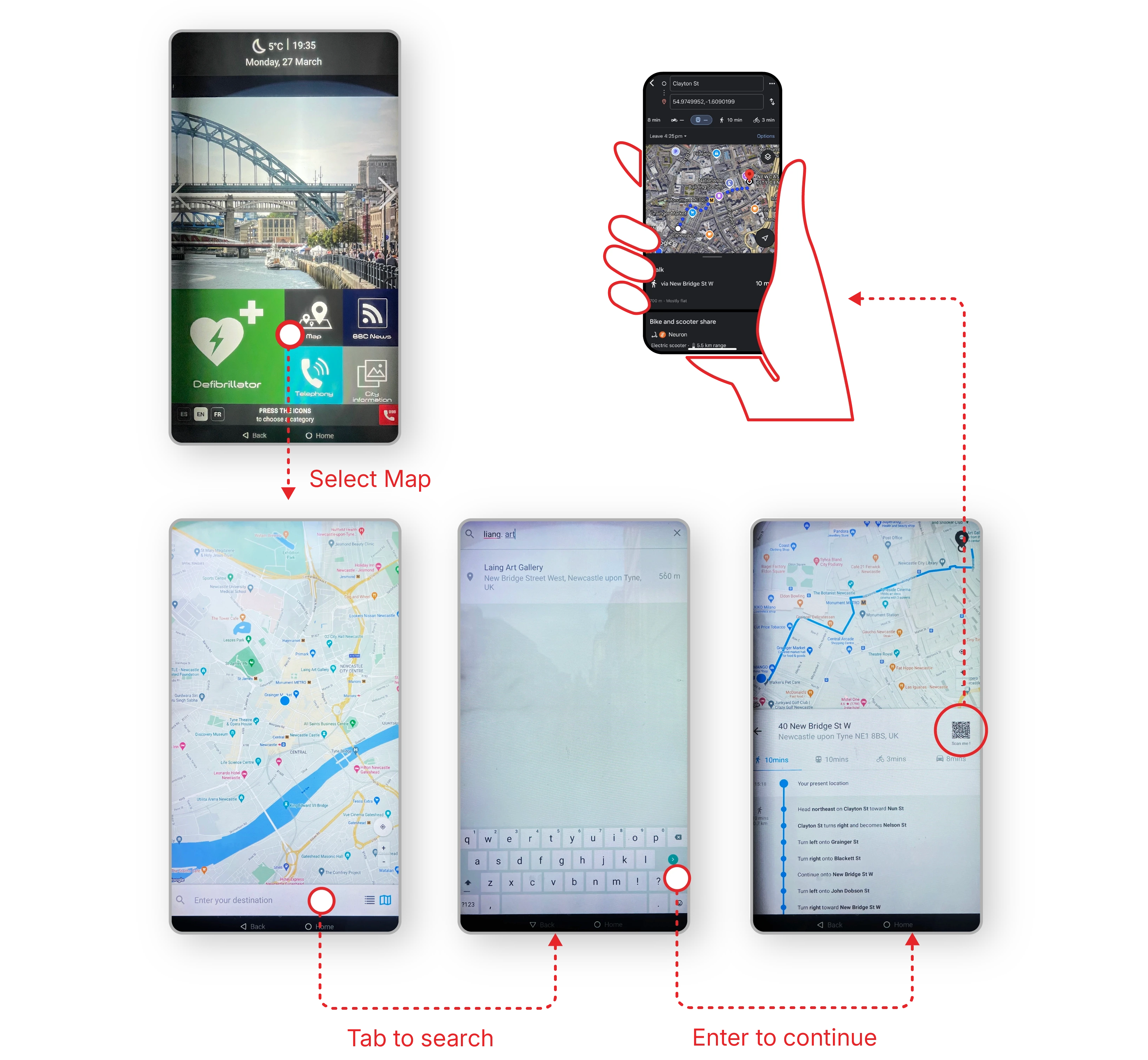
Basic destination search functionality
Provides route directions on screen
Relies on QR code generation
Routes ultimately redirect users back to phone-based Google Maps
Identified Issues:
Makes users go back to their phones - defeating the purpose
Breaks user journey by redirecting to personal devices
QR code system creates accessibility barriers
Lacks standalone navigation capability
User Research
Let's hear the users voice
We conducted semi-structured interviews with 6 visitors in Newcastle city centre, using convenience sampling to recruit participants passing by the kiosks. Each 10-15 minute session combined interviews about tourist behaviour with observational tasks testing kiosk interactions.
Interview Structure:
Tourist behaviour and travel patterns
Hands-on kiosk testing: Exploring city information, Searching for destinations, Route finding
Key Findings:
Tourist Behaviour Pattern
4 out of 6 participants were match-day visitors
Characteristics of match-day tourists:
Single-day visits centred around football matches
No planned itinerary beyond the game
Significant idle time before matches
Untapped opportunity for local exploration
Usability Insights: City Information Feature
Users expected but couldn't find:
Basic attraction details
Opening hours
Brief descriptions
Suggested nearby attractions
Recommendations for time-filling activities
Usability Insights: Navigation System Limitations
Current issues:
Redundant Google Maps interface
Route memorisation difficulties
QR code system creates phone dependency
Accessibility concerns (phone/battery reliance)
Personas
To better guide the design and enable everyone on the team to empathise with our users, I further synthesised the interview results and came up with the following personas:
Match Day Visitor
James, Sam, Ben

Manchester
Needs:
Attending 19:30 match at St. James' Park
First-time visitor to Newcastle
Looking to explore the city before match
Wants to find local spots to spend time with friends
Frustrations:
Arriving early (10:00) with 9+ hours to fill
No pre-planned itinerary
Relying on phone searches for recommendations
Difficulty finding match-day friendly venues
Culture Explorer
Lee

Leicester
Needs:
Making the most of one-day stopover
Seeking authentic local experiences
Interested in cultural attractions
Prefers walking exploration
Looking for hidden gems
Frustrations:
Limited time for pre-trip research
Wants to avoid tourist traps
Difficulty finding walkable routes
Overwhelmed by scattered information
Unsure about realistic time management
Ideation
From Insights to Solutions
The ideation phase began with a collaborative brainstorming session, bringing together insights from our research and personas. I encouraged the team to be free thinking and creativity, initially setting aside technical constraints to explore all possibilities.
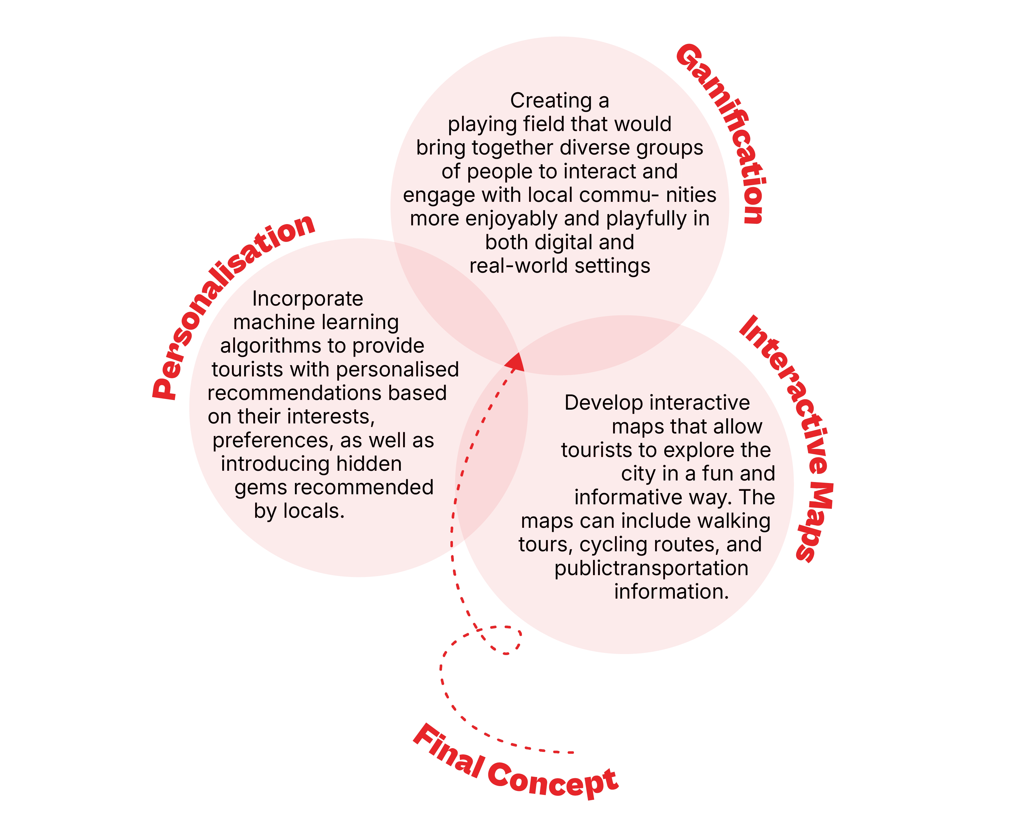
The ideation process brought together diverse concepts ranging from gamification to personalised recommendations. Each idea underwent careful evaluation for user inclusivity and implementation feasibility. Take gamification, for instance - while gamified elements promised engaging experiences, complex features like character progression or achievement levels risked alienating certain age groups. This insight led to refining the concept into a simpler collectible system that maintains engagement while appealing to all users.
The final solution distilled into 5 core functionalities:

Phone-Independent System
• Enables full environmental immersion
• Reduces digital dependency
• Accessible to all users
Smart Route Generation
• Creates walkable paths
• Considers time constraints
• Links points of interest
Local Discovery
• Highlights hidden gems
• Integrates local recommendations
• Balances popular and lesser-known spots
Collectible Elements
• Physical souvenirs (postcards, stamps)
• Creates memorable experiences
• Encourages exploration
Accessibility
• Voice navigation support
• High contrast display options • Screen reader compatibility
• Simple, intuitive interface following WCAG guidelines
• Physical assistance button for immediate helps
Design Approach
Physical-First Navigation System
The design approach focuses on utilising physical touchpoints to create a phone-independent navigation experience. By leveraging tangible objects and existing infrastructure, the system comprises three interconnected elements that work together to create a seamless navigation experience:
Kiosk
Enhanced Kiosk Integration The existing city kiosks serve as the primary touchpoint, transformed into interactive route planning stations where tourists:
• Select personalised or reccommended routes
• Generate customised WanderCards
• Access local recommendations
• Begin their exploration journey
WanderBox
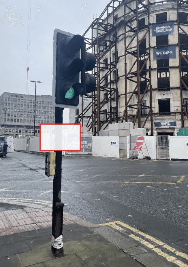
Through analysis of tourist journey needs, it became clear that kiosks alone couldn't provide continuous navigation support. This insight led to the development of WanderBoxes - smart navigation aids strategically integrated with traffic light infrastructure:
• Guide tourists at key decision points
• Provide real-time directional assistance
• Enable instant route confirmation
• Assist with immediate wayfinding needs
WanderCard
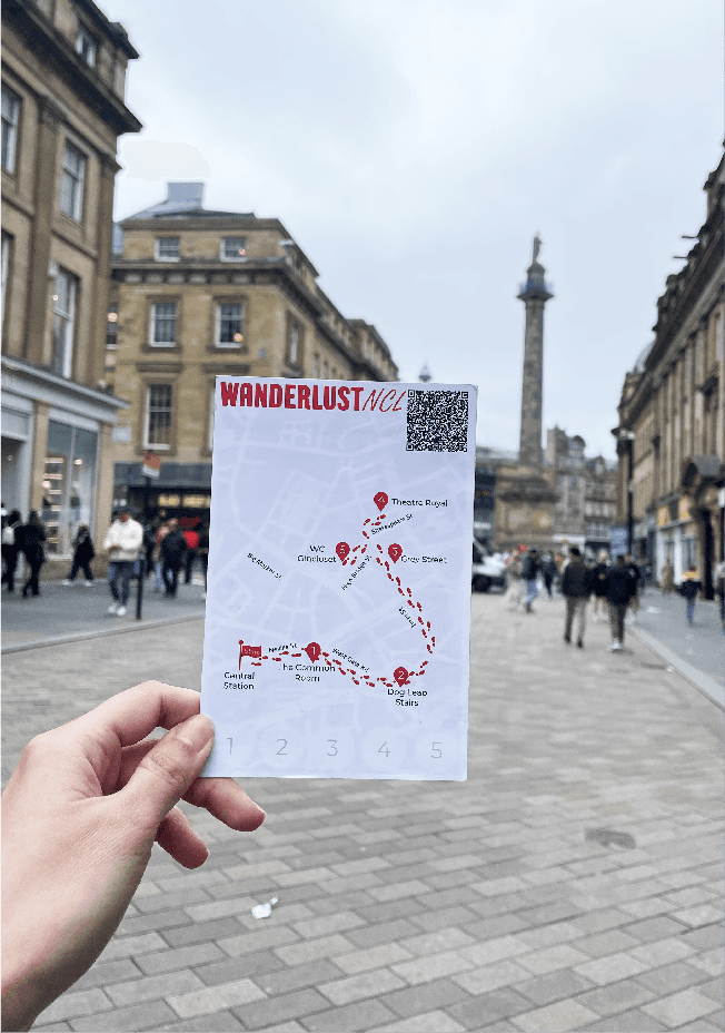
A physical companion that doubles as both navigation tool and souvenir:
• Contains printed route information
• Collects destination stamps
• Creates tangible travel memories
• Encourages complete exploration
User
Tourist Journey Flow
The journey begins at city kiosks, where tourists create personalised routes and receive their printed WanderCard. Throughout their exploration, strategically placed WanderBoxes guide them by providing directions when they scan their card. At each destination, tourists collect unique stamps on their WanderCard, transforming their navigation tool into a memorable souvenir of their Newcastle experience.
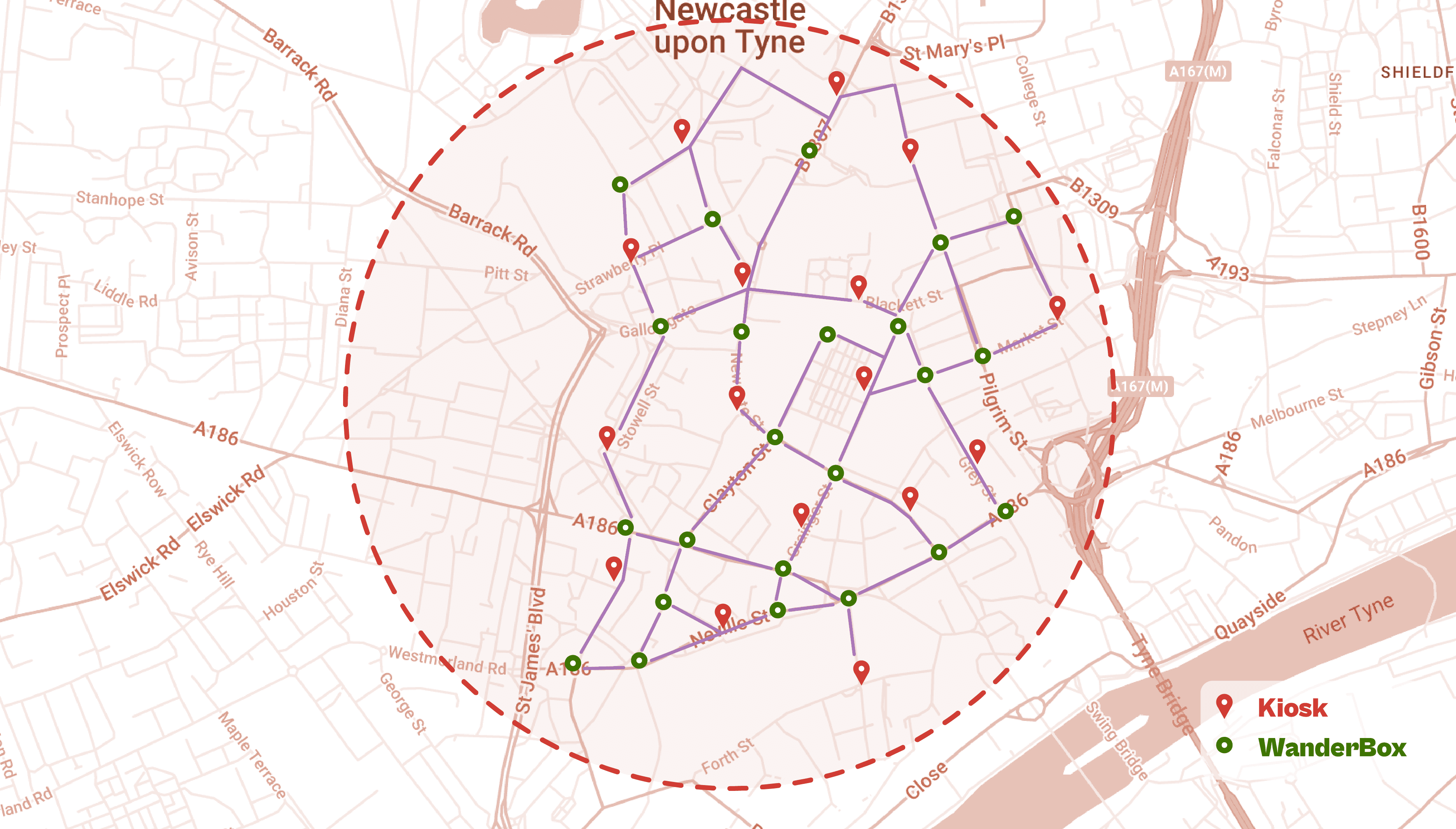
The map showcases the deliberate positioning of WanderBoxes at key intersections, complementing existing kiosks throughout Newcastle's centre. This network ensures continuous navigation support along tourist routes, creating an uninterrupted guidance system for city exploration.
Interface Design
Kiosk Interface
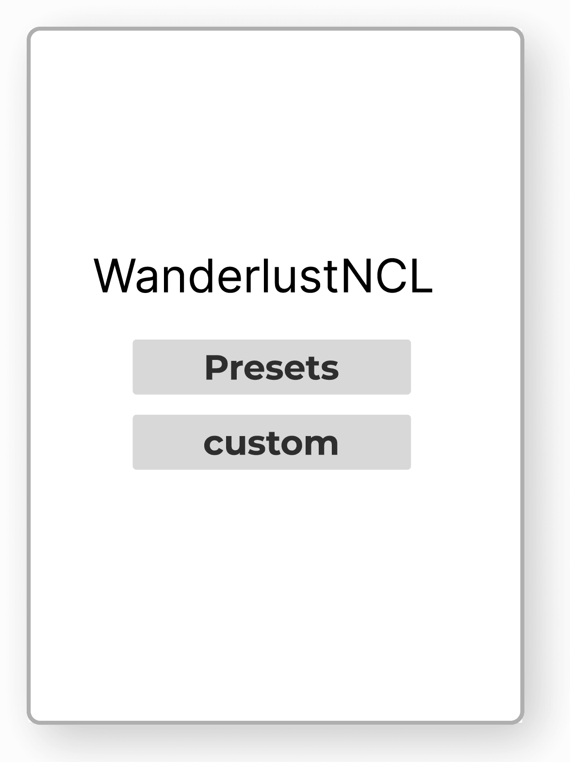
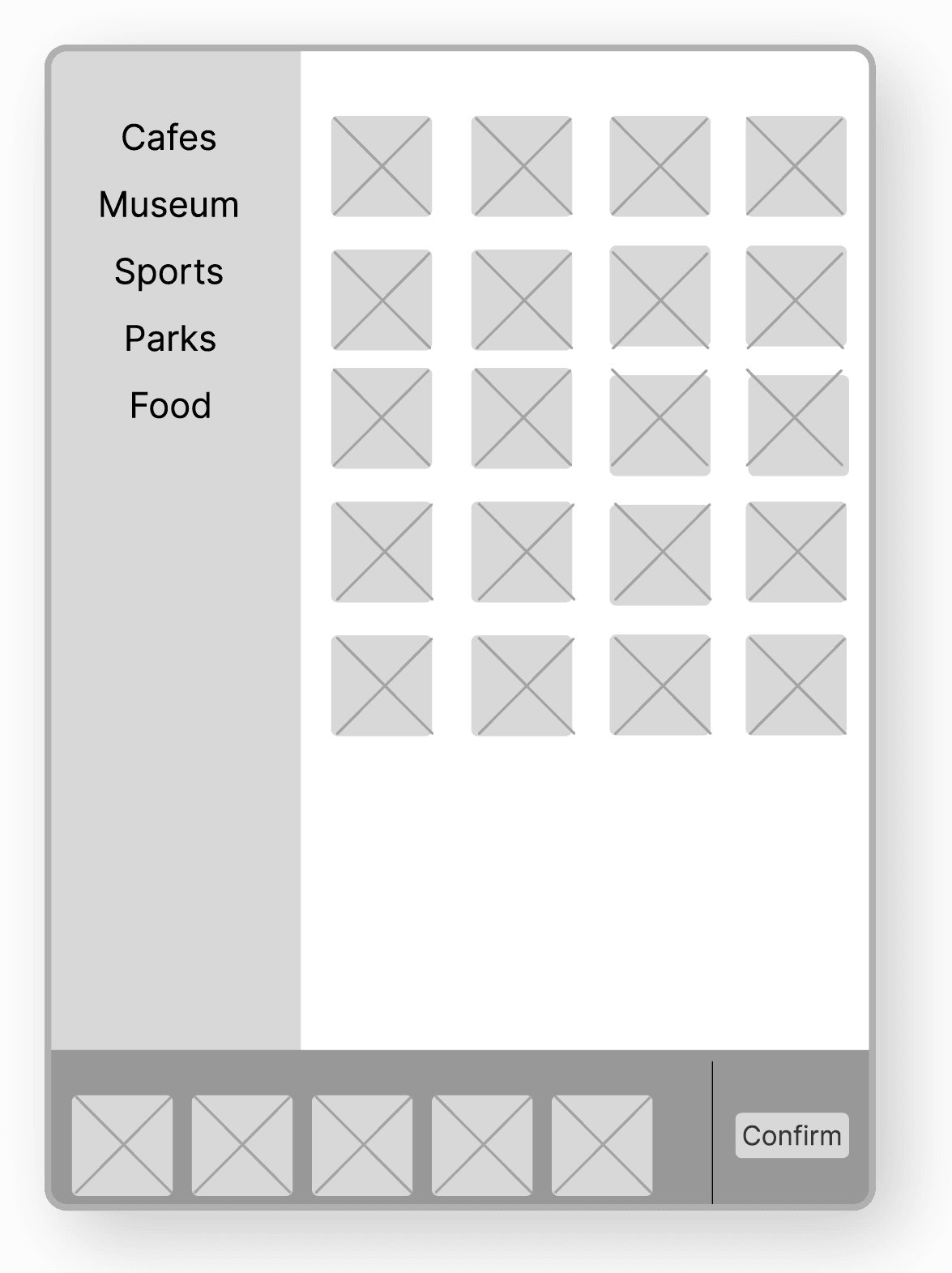
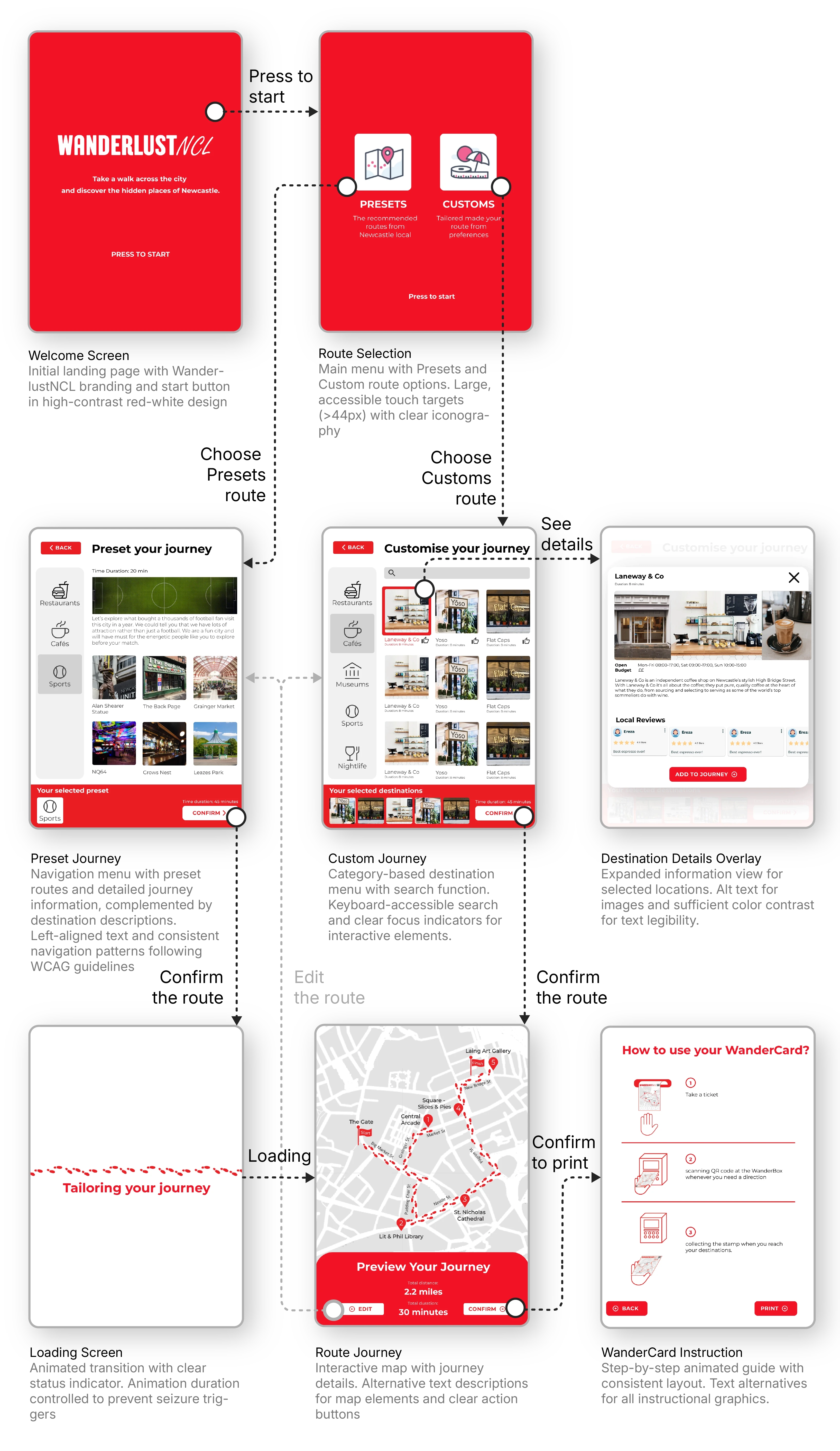
The interface offers two distinct route planning modes, each designed to serve different exploration preferences:
Preset Routes
for spontaneous explorers who are open to suggestions. These curated journeys combine local knowledge from residents and Newcastle City Council to help visitors discover hidden gems and authentic experiences, while managing crowd flow during peak times.
Custom Routes
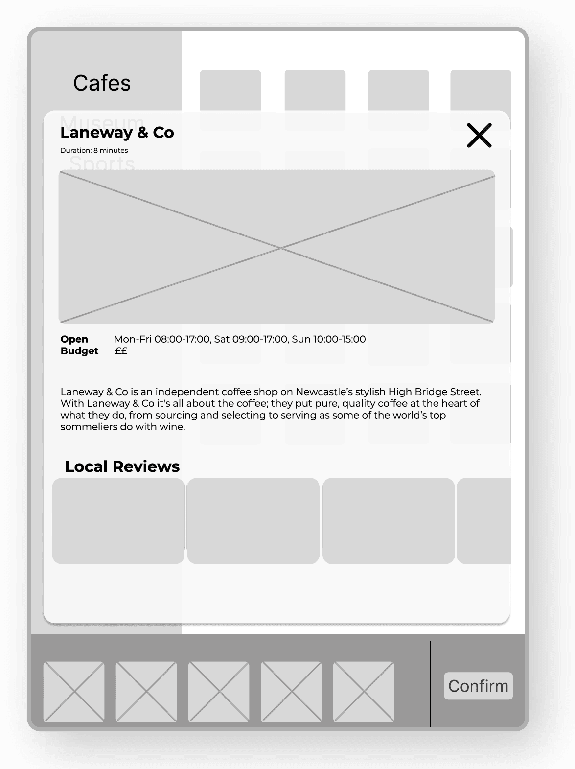
for visitors with specific destinations in mind. Users can select up to 5 locations to create their personalised route, with access to essential information like opening hours, prices, and local reviews for informed decision-making.
Kiosk Interface
Wireframing
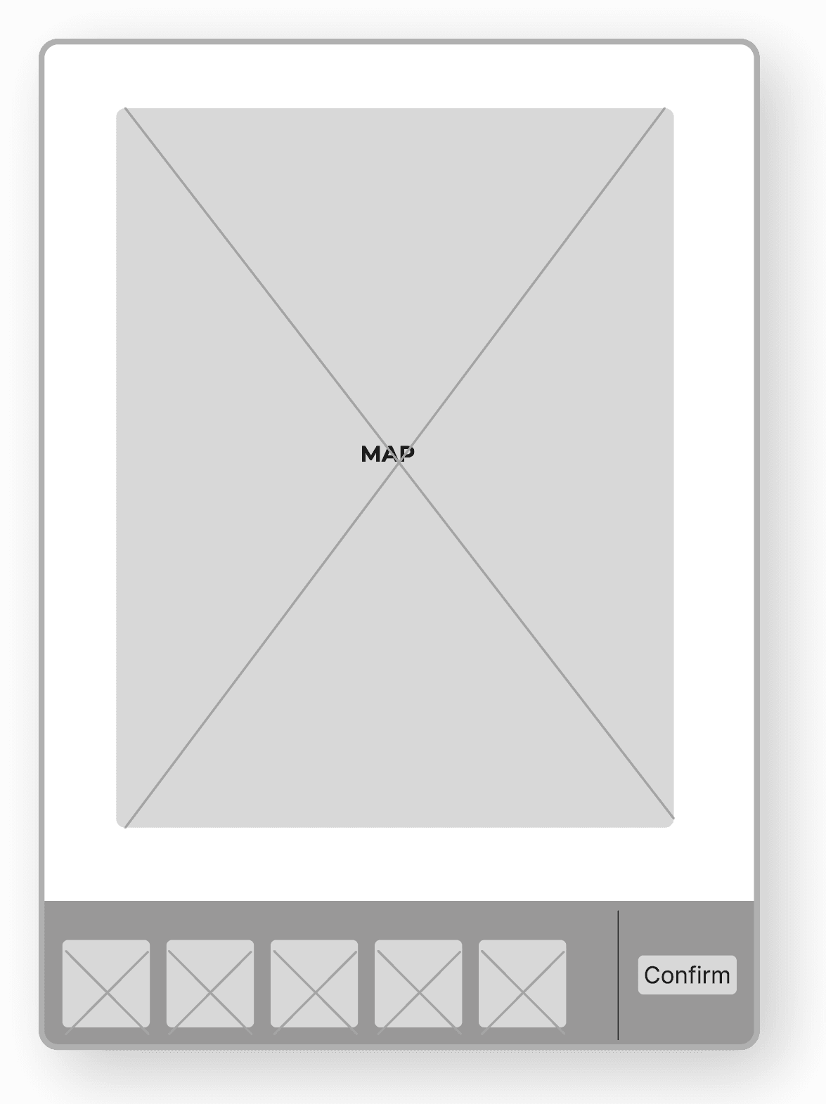
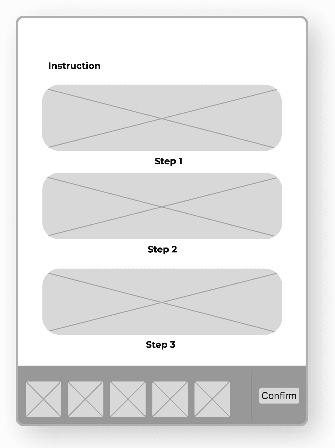
The interface design phase began with collaborative wireframing in Figma, focusing on creating an intuitive and accessible user experience. The design structure comprises 2 main interfaces aligned with the system's core functions. The layout ensures consistent navigation while maintaining clear separation between preset and custom journey options.
Landing page
Destination gallery category
Destination details
Route preview map
Step-by-step instructions
Kiosk Interface
Final UI Design: WCAG
The final interface implementation closely follows the established wireframe structure, developed as a HTML web application. While maintaining the core layout and functionality, the design incorporates essential accessibility features by adhering to WCAG standards.
Key accessibility features include high contrast ratios between text and background elements, with the signature red-white colour scheme meeting the 4.5:1 minimum requirement. Interactive elements are sized appropriately at 44x44 pixels minimum for touch targets, with clear visual feedback for all interactive states. Typography prioritises readability with adequate text sizing and spacing, while maintaining a consistent visual hierarchy throughout the interface.
The design successfully balances aesthetic appeal with functional accessibility, ensuring an inclusive experience that serves users of all abilities while preserving the engaging and intuitive nature of the WanderlustNCL system.
Kiosk Interface
The Reason Behind Red Colour
The bold red color scheme emerged from practical considerations of the physical system components, particularly the WanderBox which needs high visibility in urban environments. Red was strategically chosen for its natural ability to attract attention and stand out in varied environmental contexts, creating strong contrast against typical city backgrounds.
The color consistency across all components - from physical WanderBoxes to the digital interface and printed WanderCards - creates a cohesive and instantly recognizable system throughout the user journey.
Physical Prototyping
Kiosk
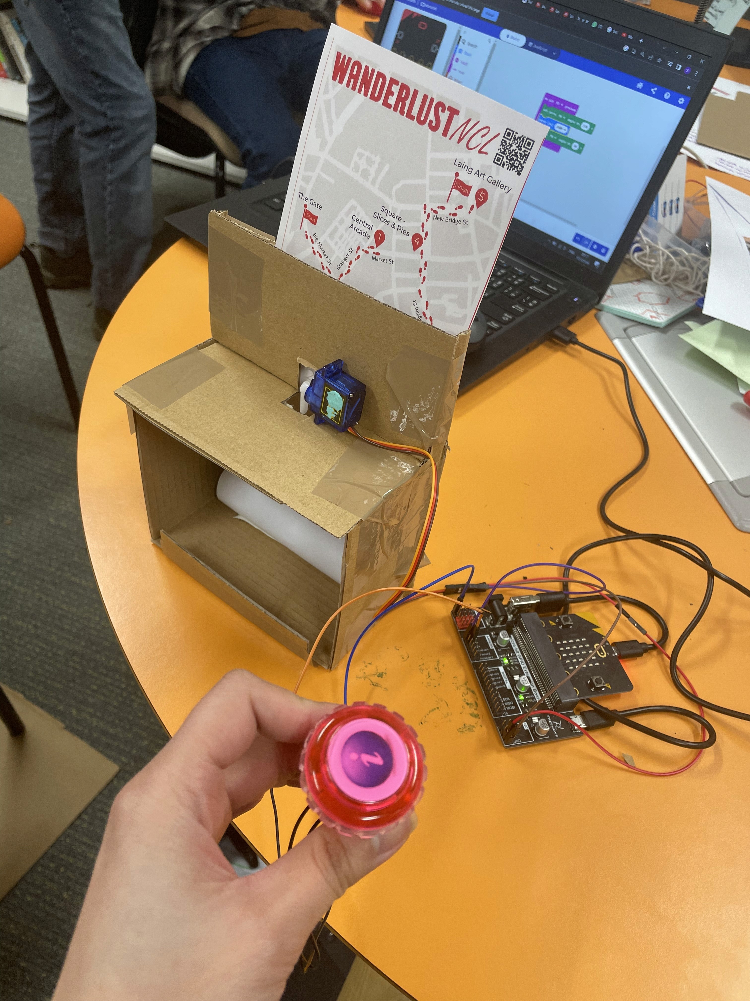
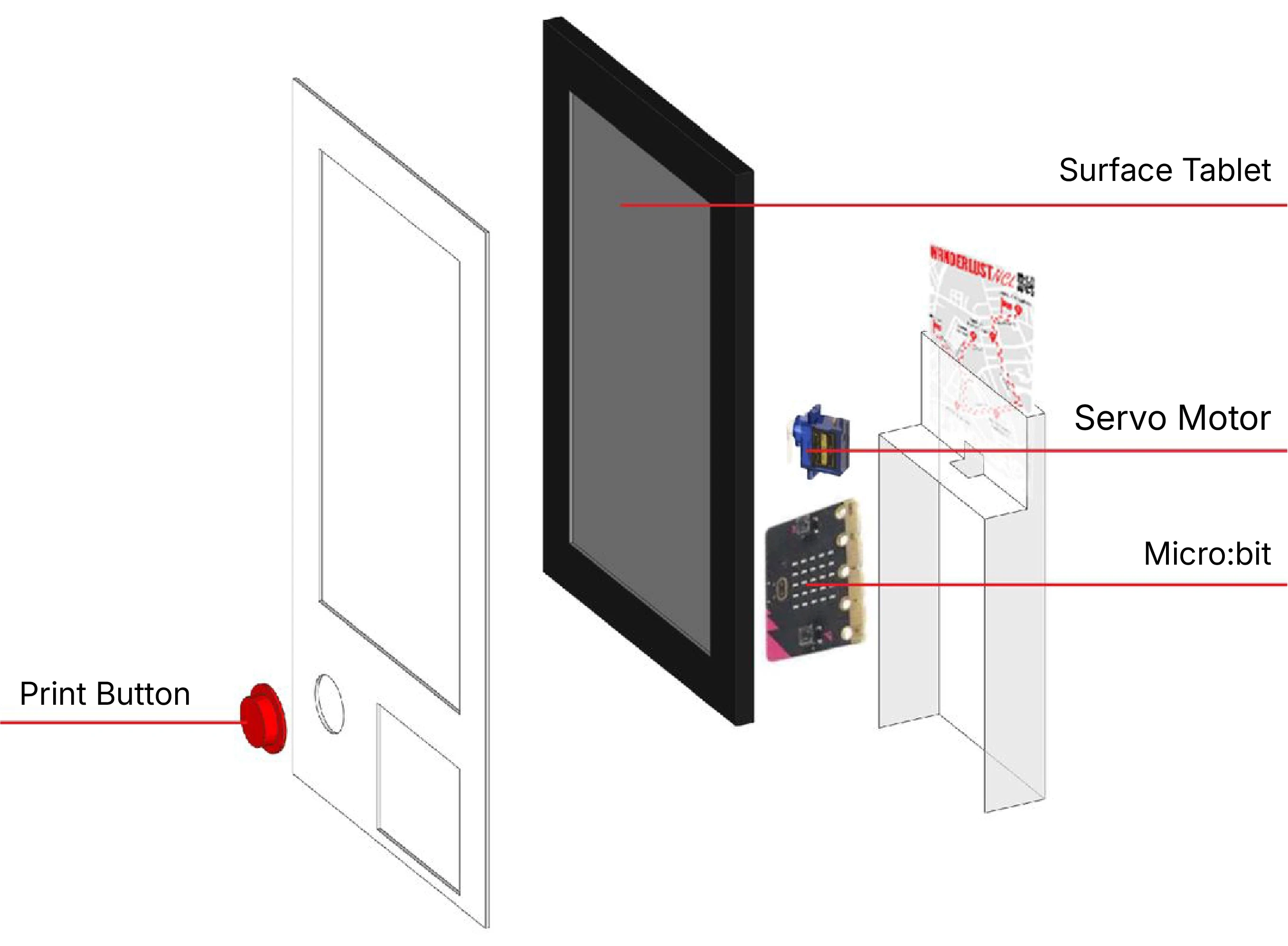
To demonstrate the complete system functionality without access to actual city kiosks, a physical prototype was developed to simulate essential kiosk operations. The prototype focused on 2 core functions: interactive screen interface and ticket printing mechanism. Using a Surface tablet for display and a servo motor controlled by Micro:bit and servo motor for the printing simulation, the prototype effectively demonstrated how users would interact with the system to create and receive their WanderCards.
The development process followed 2 stages:
Paper Prototype
Initial testing using paper construction allowed for quick iterations and functional validation of the card dispensing mechanism before moving to permanent materials.
Final Prototype
The refined design was produced using laser-cut acrylic, creating a durable, professional-looking unit that effectively demonstrates the kiosk's core functions - from route selection through to WanderCard printing
WanderBox
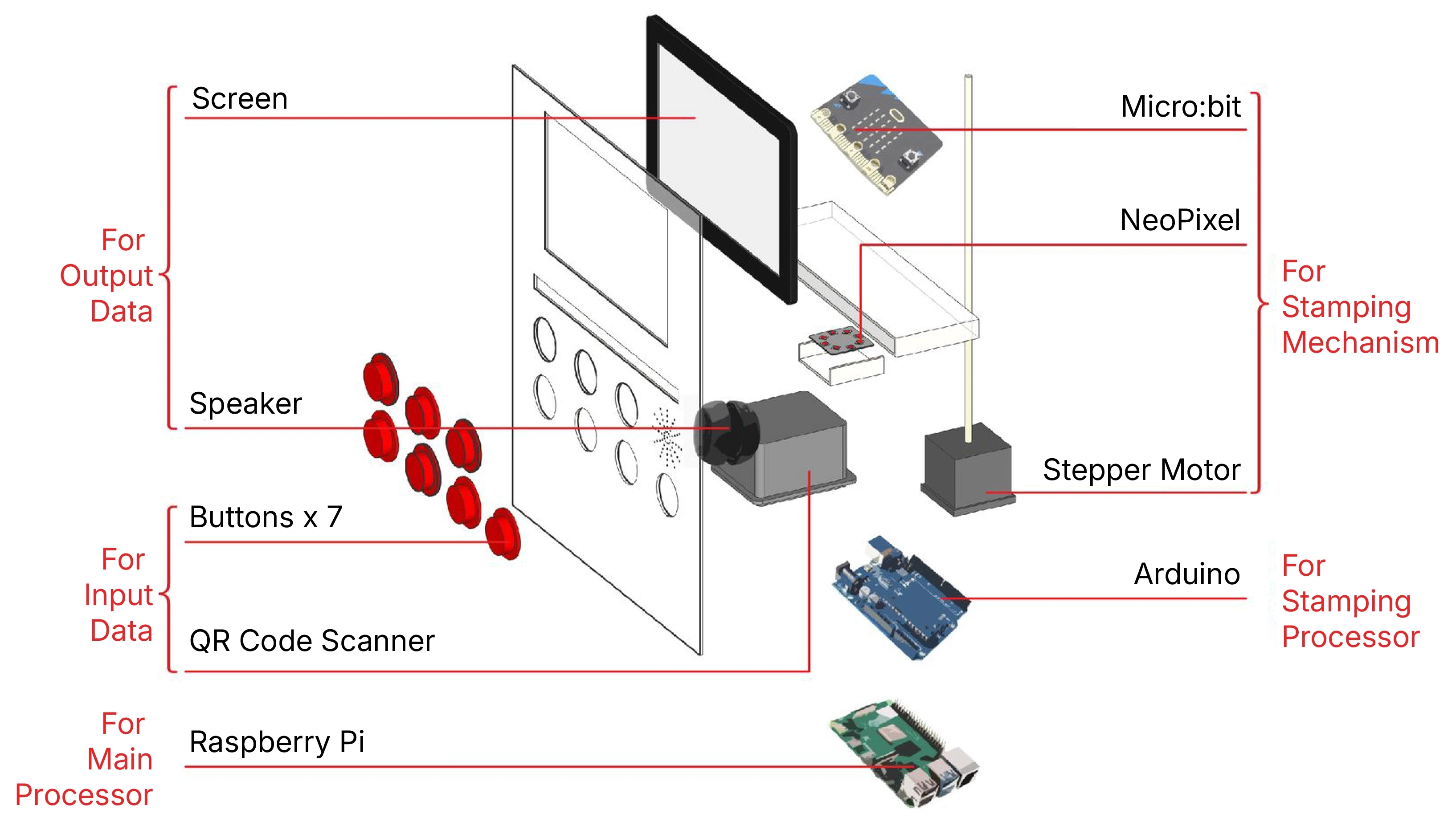
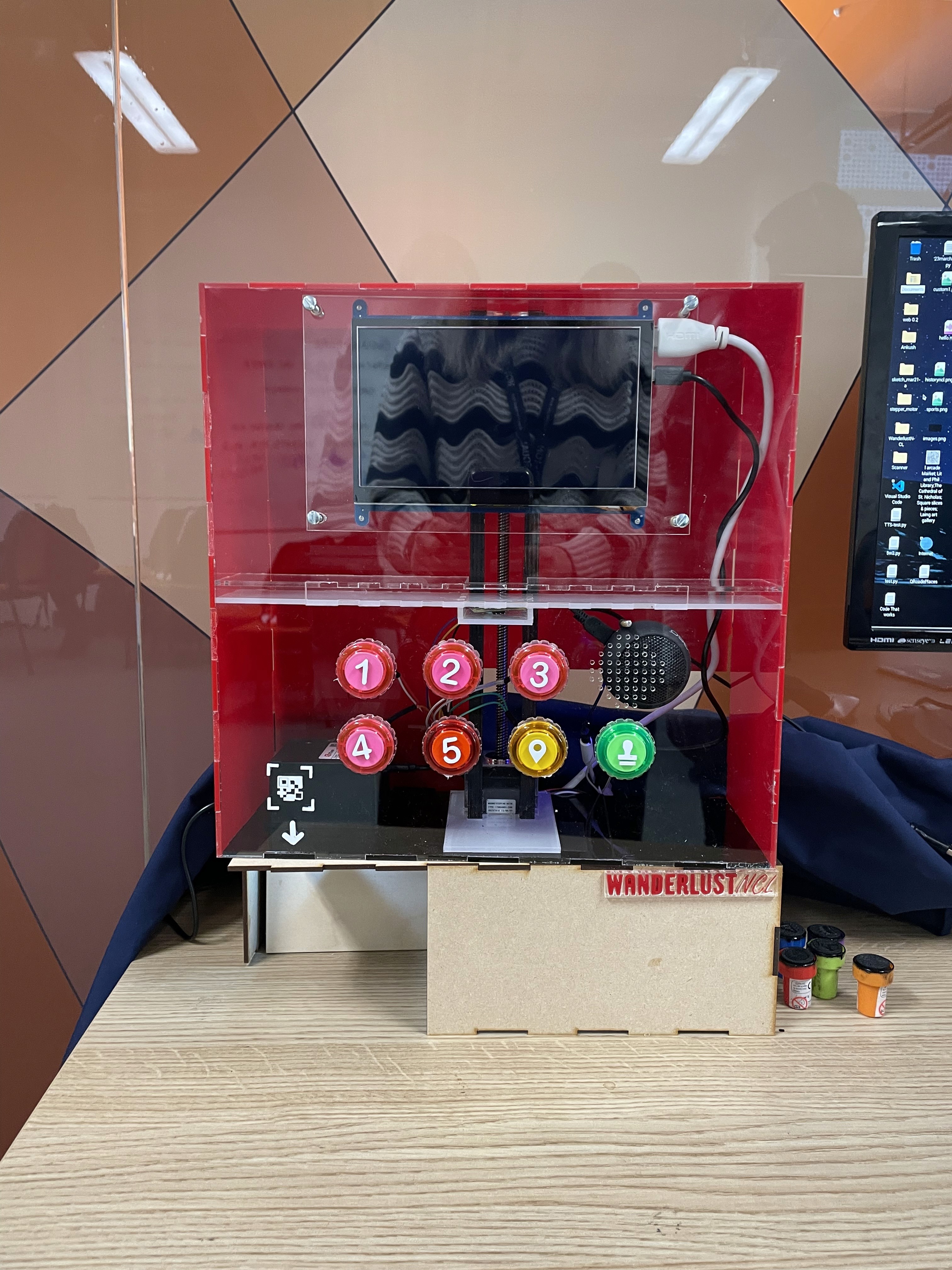
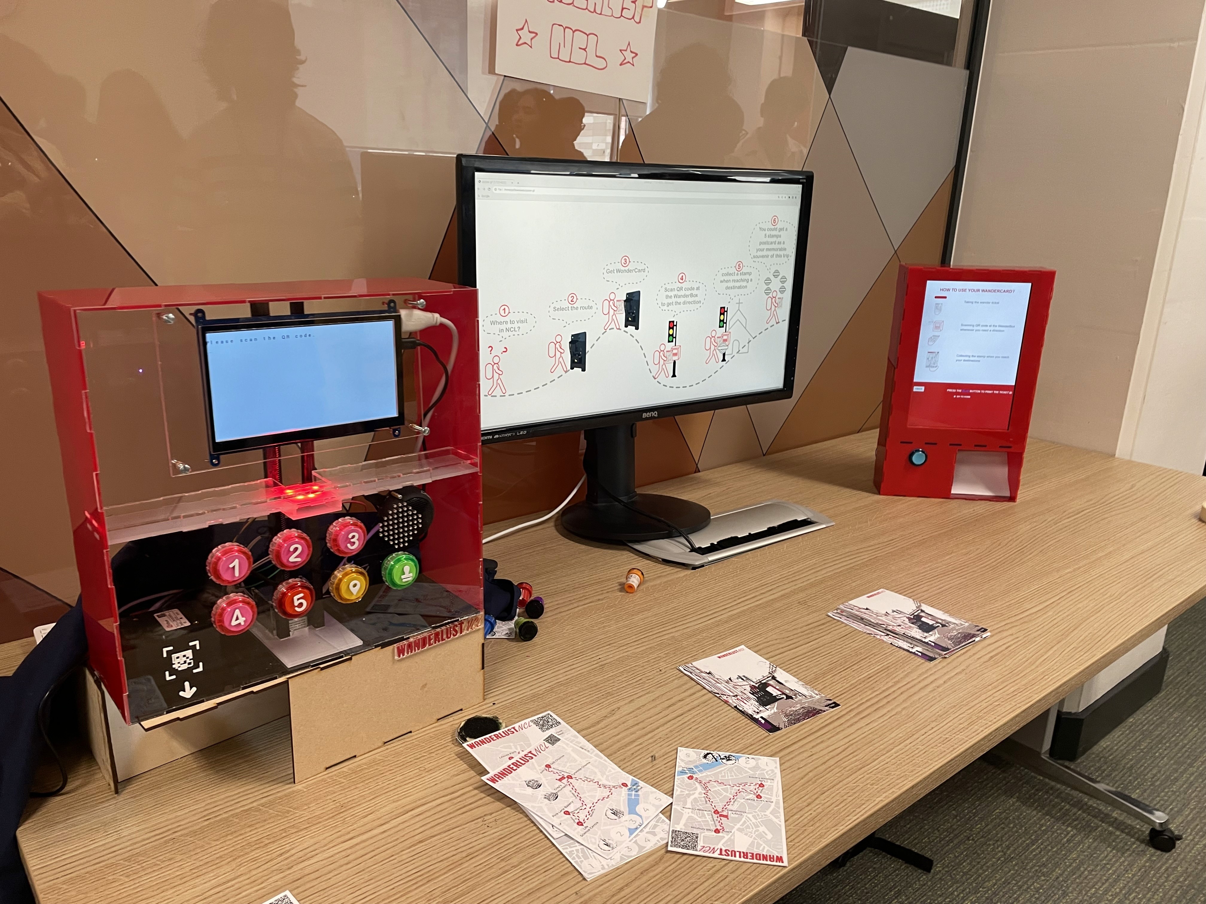
A functional WanderBox prototype was developed to demonstrate key navigation interactions at city intersections and destinations. The design integrates both input and output features to create an intuitive user experience.
For output, the system uses a screen displaying text-based UI for visual directions and a speaker for audio guidance. Input methods include interactive buttons and a QR code scanner for WanderCard recognition. The prototype also features a stamping mechanism with LED guidance to help users correctly position their WanderCards for collecting destination stamps.
Accessibility Considerations
The WanderBox design adheres to WCAG, implementing comprehensive accessibility features to serve users of all abilities. The input system prioritizes physical interaction through tactile buttons with clear labeling and consistent layout, offering an alternative to screen-based interactions. Each button meets minimum size requirements and provides clear feedback, creating a predictable interface that reduces cognitive load.
The system delivers information through multiple channels to ensure universal access. Visual output features high-contrast text displays, while audio feedback includes voice guidance for navigation and interaction confirmations. All audio prompts are clear and descriptive. The text-based interface ensures compatibility with screen readers, while step-by-step instructions proceed at the user's pace without time constraints.
WanderCard
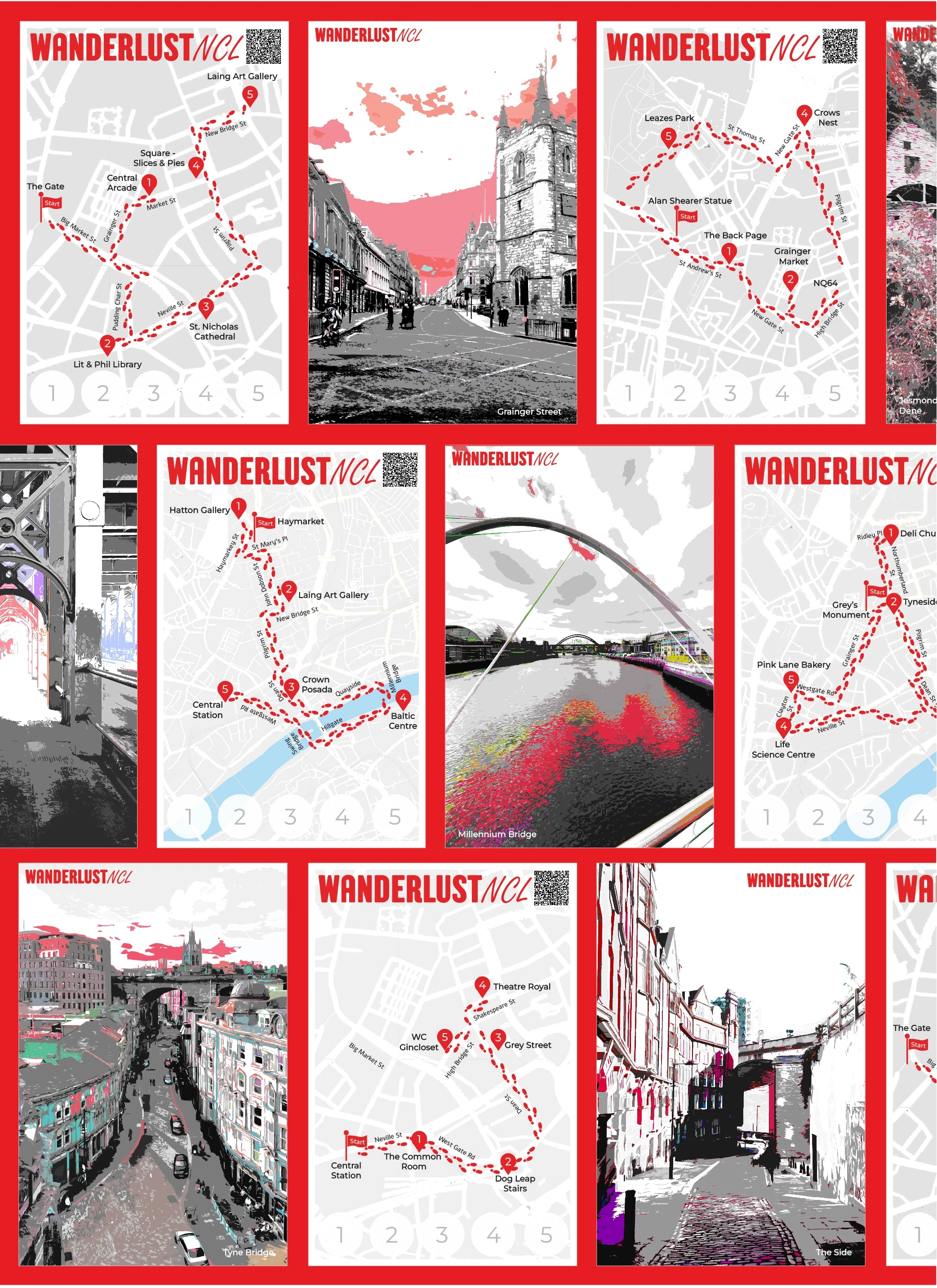
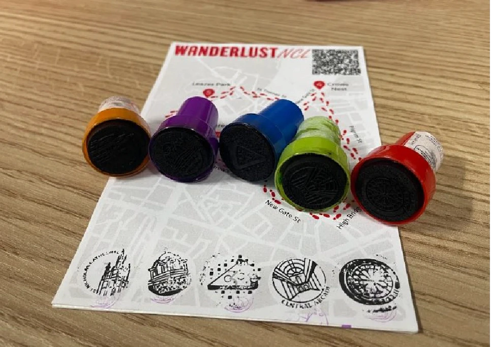
The WanderCard functions as both a practical navigation tool and a memorable souvenir of Newcastle exploration. Designed to match standard postcard dimensions (4x6 inches), the card features a thoughtfully organised dual-sided layout. The front face combines a simplified route map rendered in the system's signature red with an optimised QR code (2.5x2.5 cm) positioned for reliable scanning. 5 designated stamp positions along the route await collection at key destinations, creating an interactive journey record. The back of the card showcases curated Newcastle imagery in striking red and white duotone, with different designs randomly distributed to encourage collection among visitors.
Custom Destination Stamps
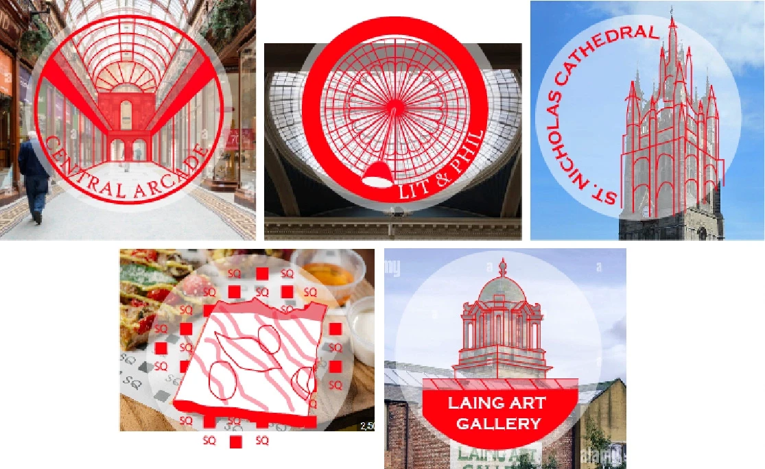
The stamping system's design evolved through multiple testing phases. The original plan called for an automated self-inking mechanism, but practical challenges with the ink system and motor connections led to a simpler, more effective solution. The final design uses wooden stamps created through laser cutting, each featuring unique illustrations of Newcastle destinations. This approach proved more reliable while maintaining the project's distinctive visual style.

